Adventures in Printmaking
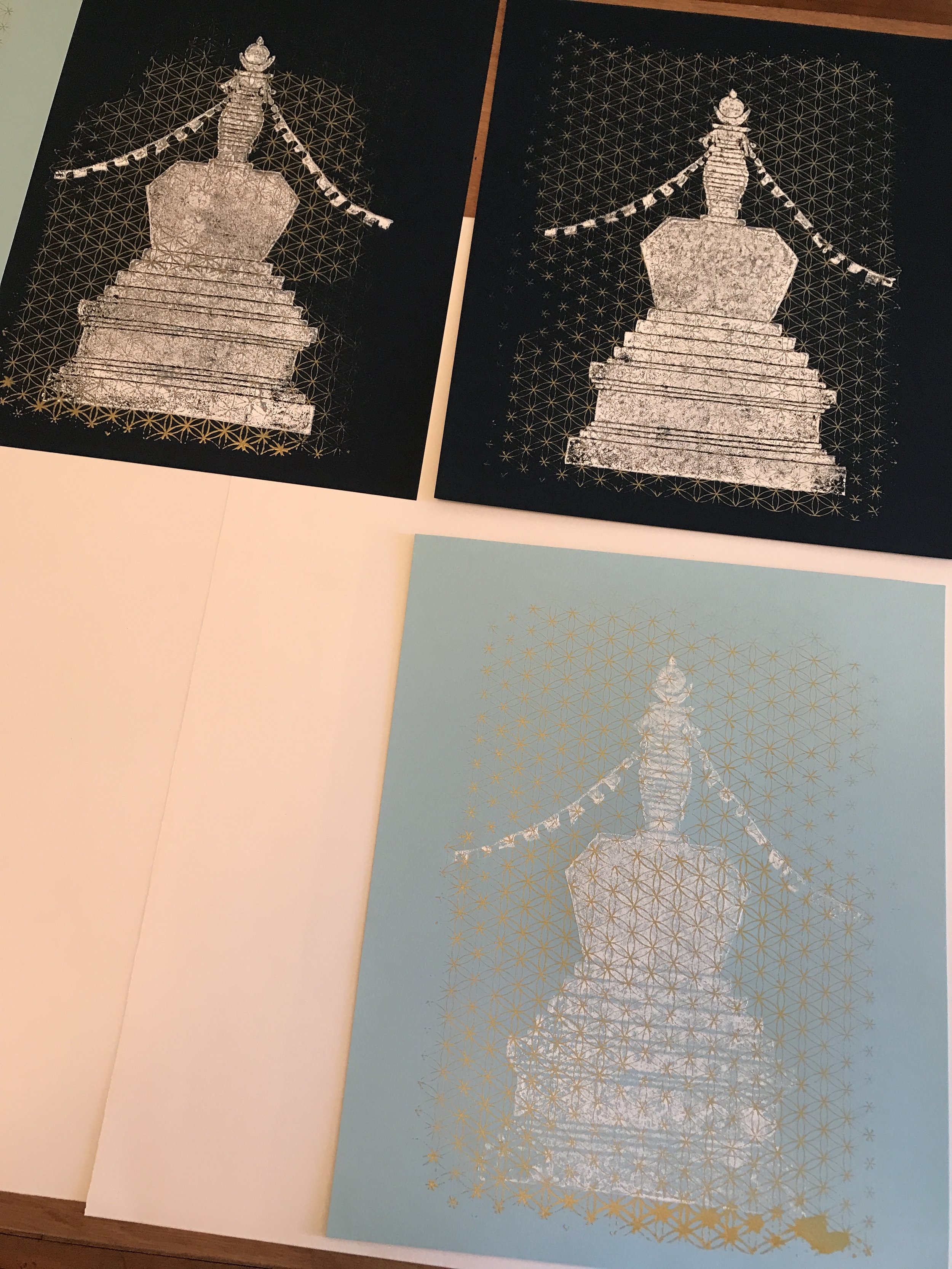
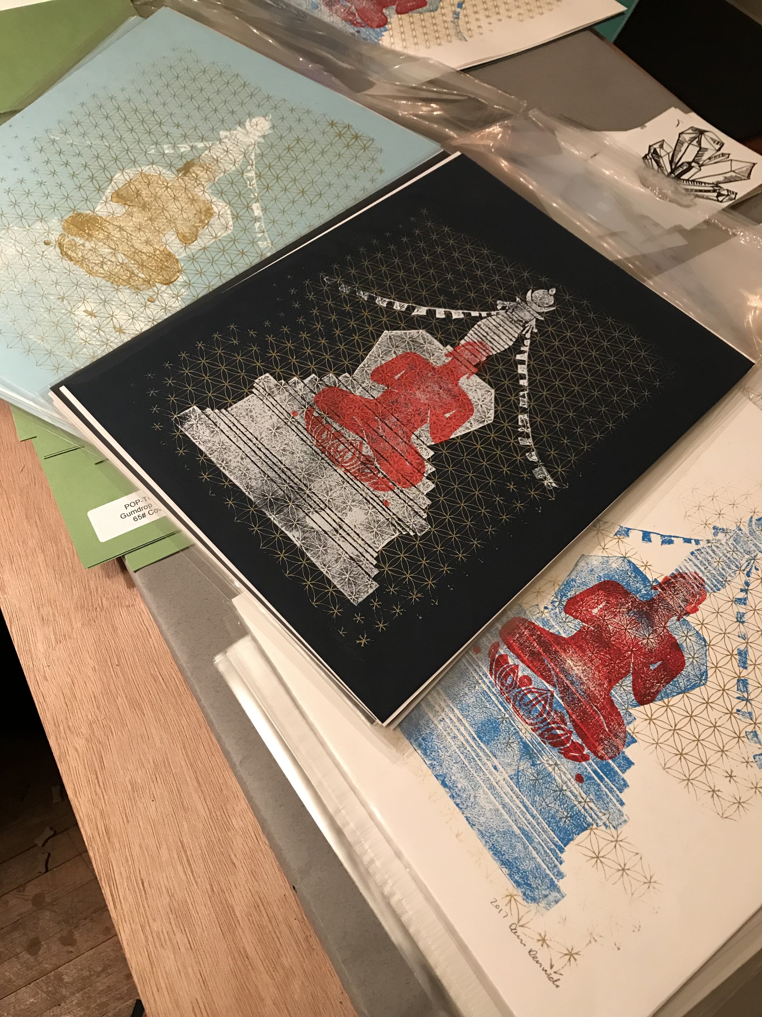


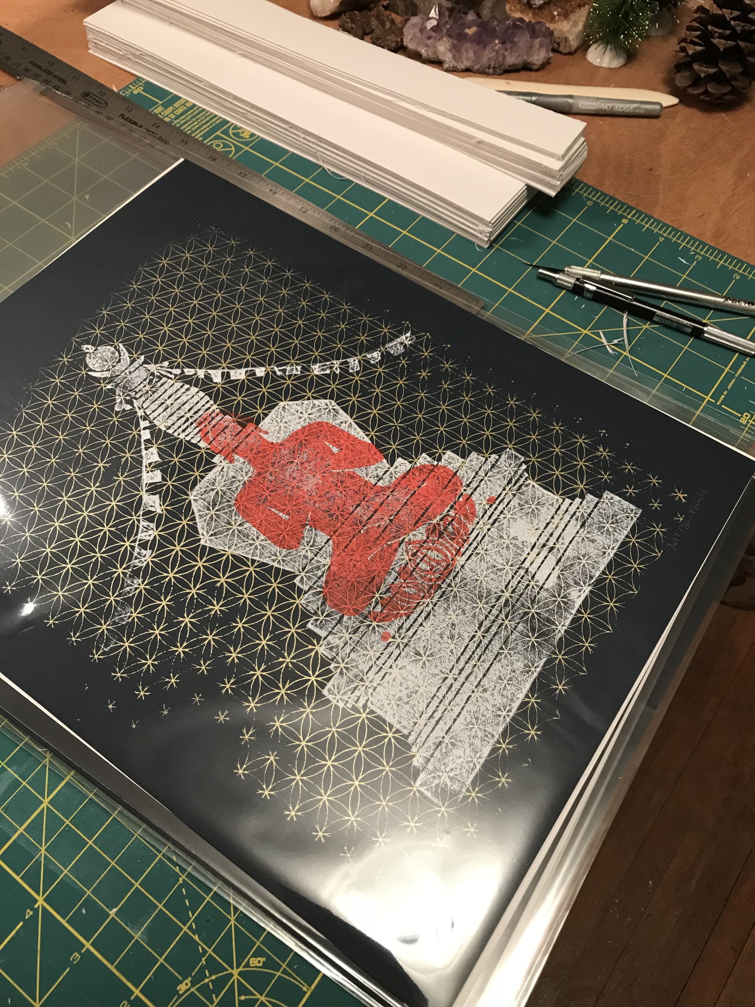
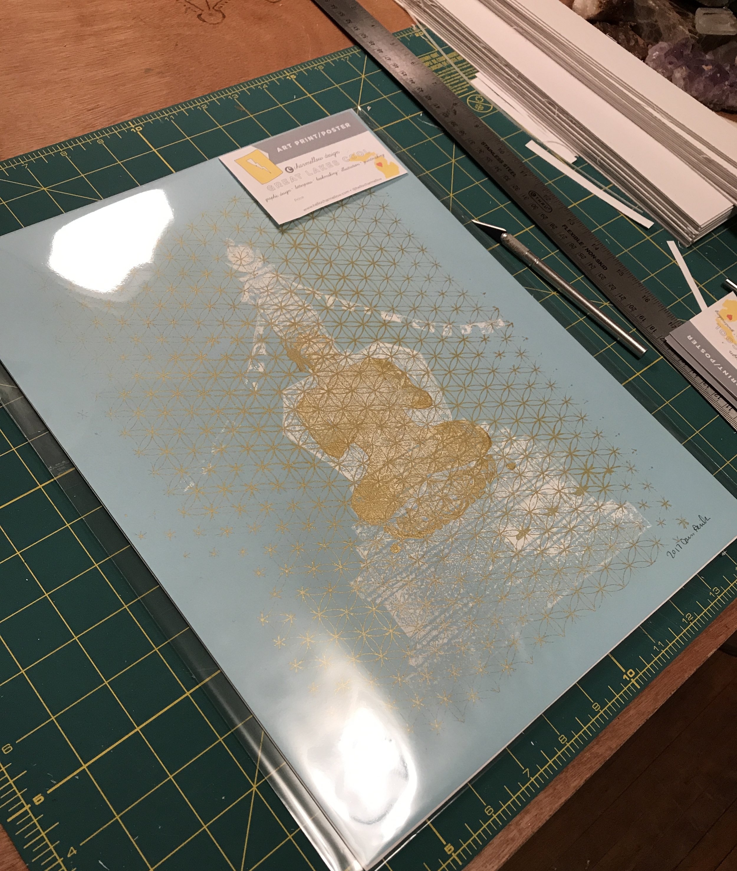
Art Inspired by the Great Stupa of Dharmakaya in Colorado
This year has been pretty crazy for Charmellow. I saved some printing presses from the scrap yard in the spring and have been on a mission of rediscovering my printmaking love ever since. The presses are out in Hoxeyville, 15 miles or so west of Cadillac. They are in a friends garage, covered, along with the rest of the shop. I will do a post about the equipment soon!
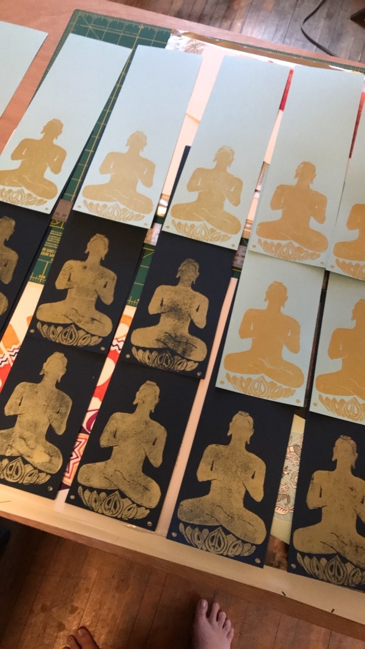
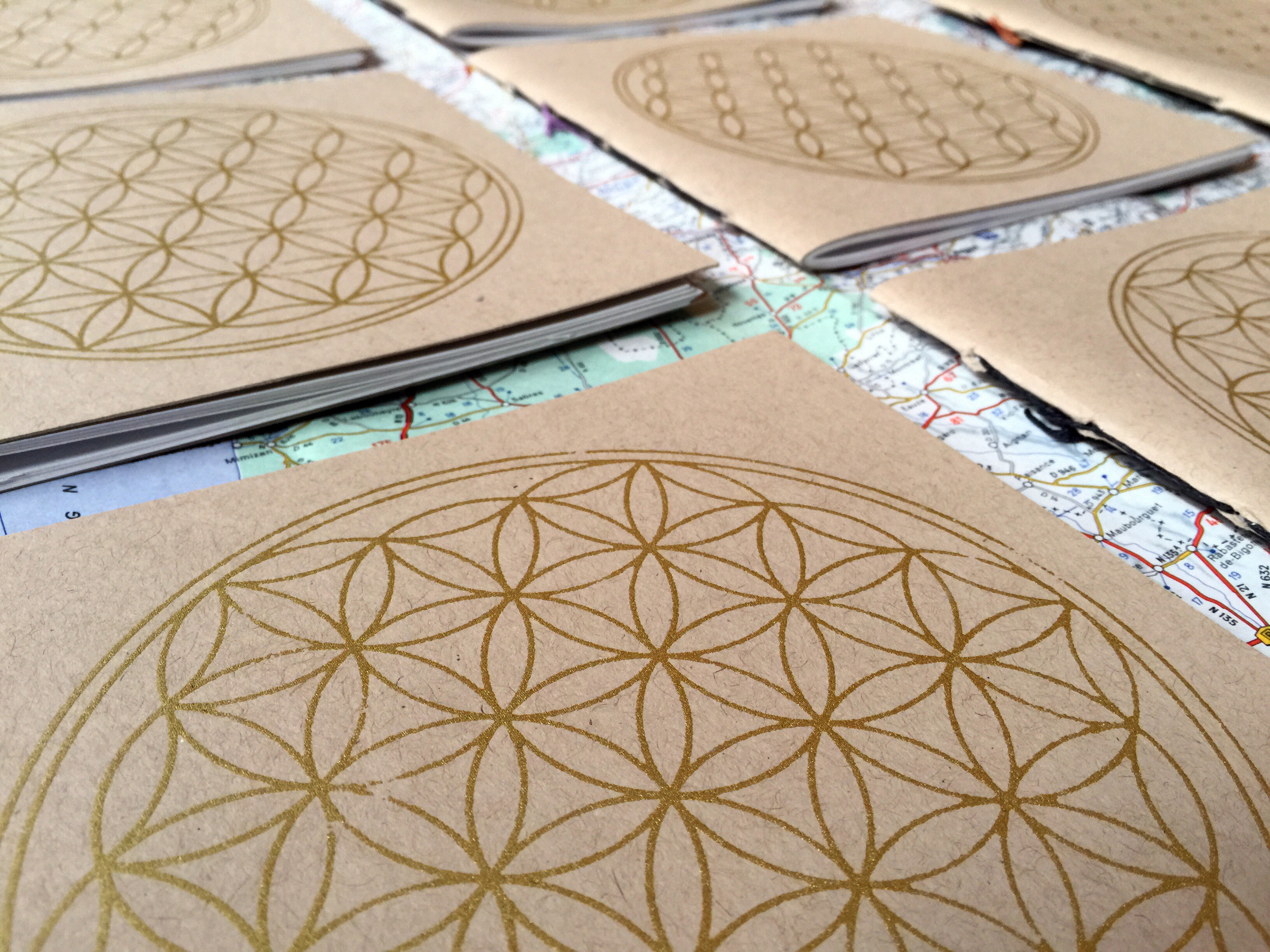
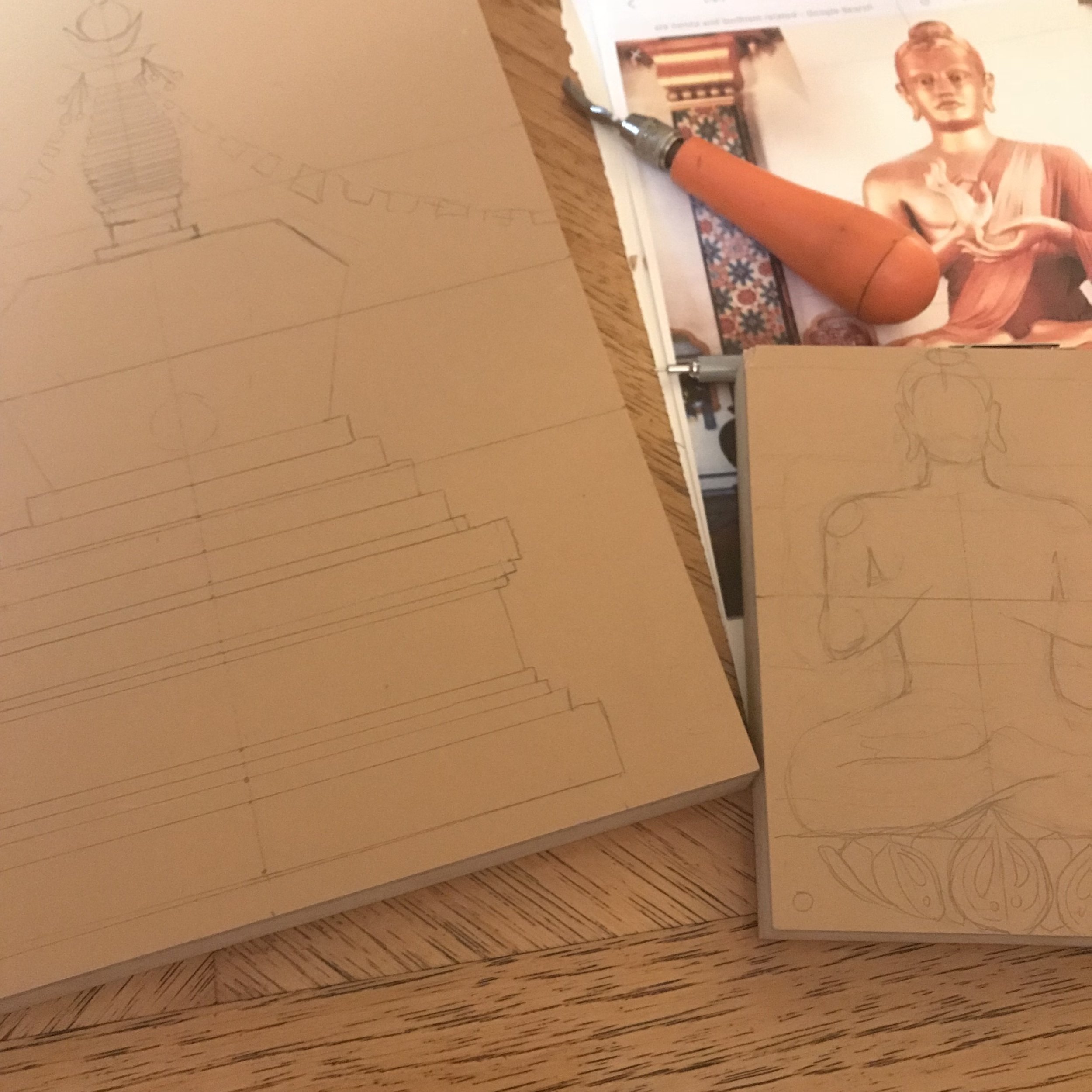
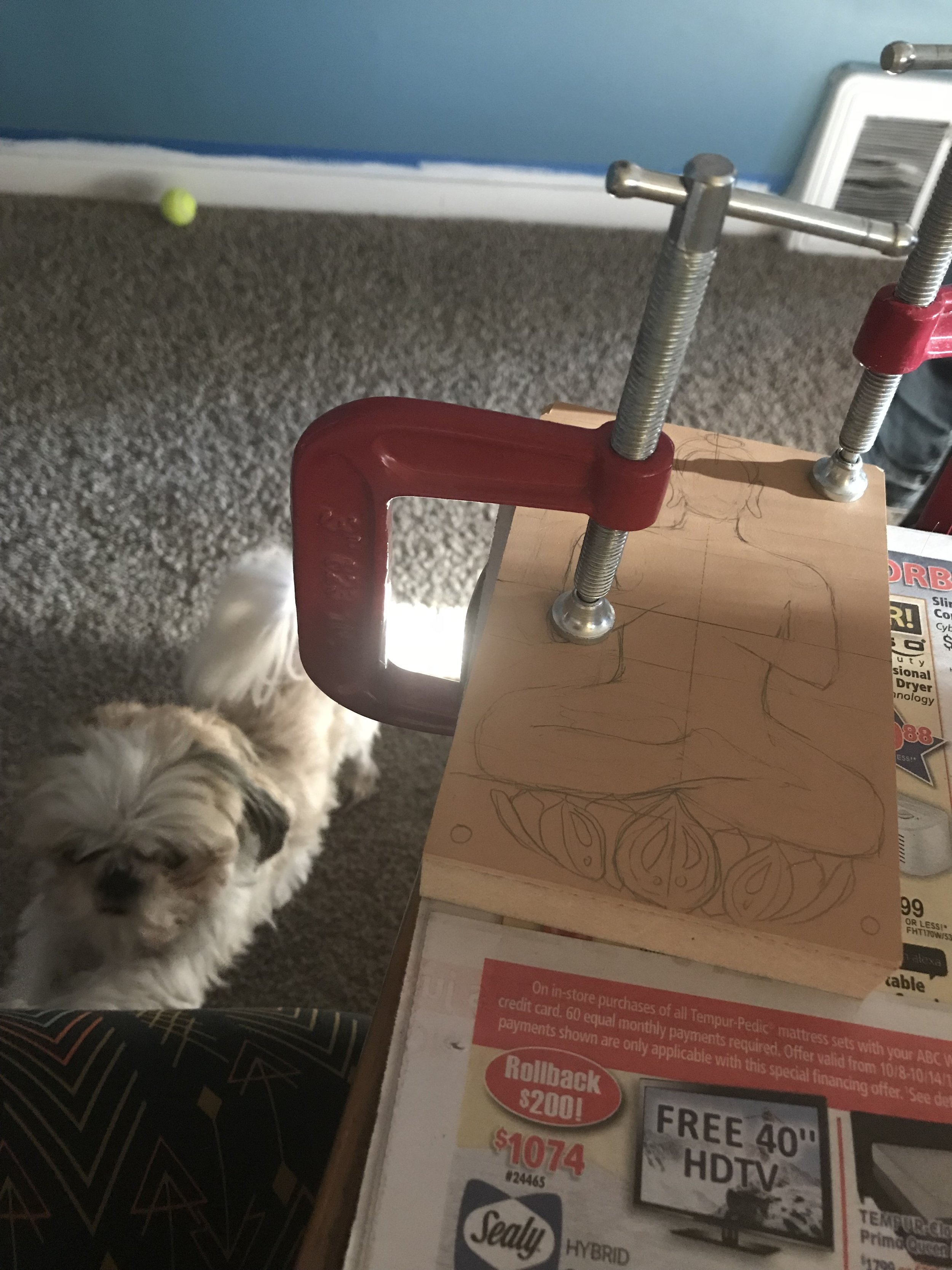
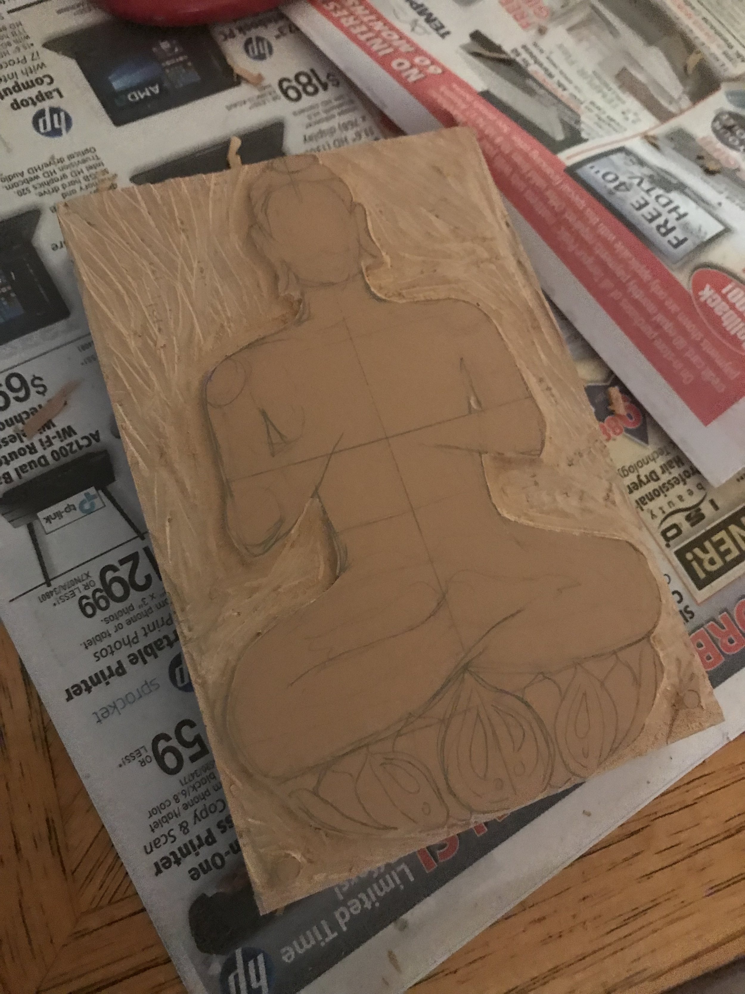
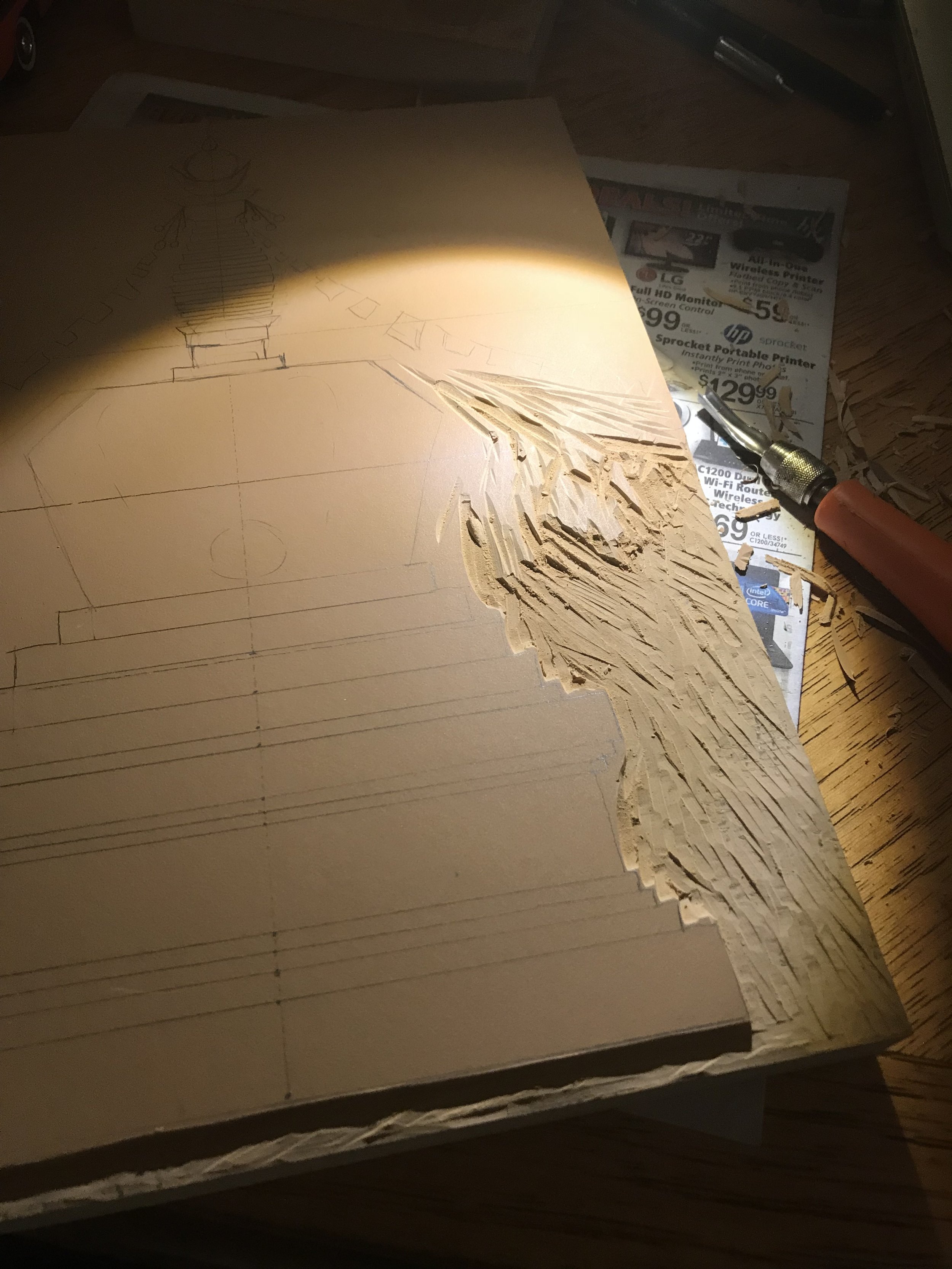
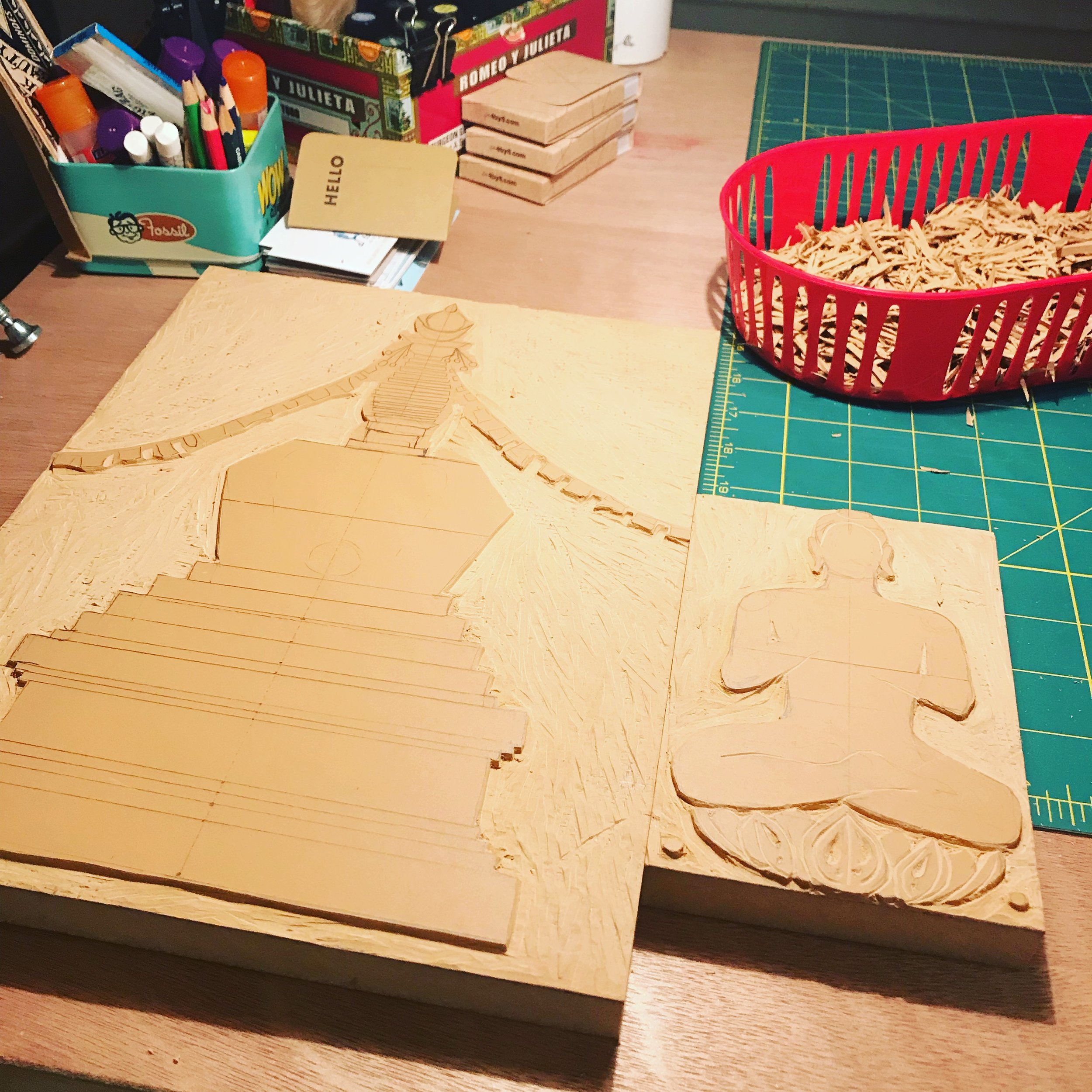
Anyway the presses in general have inspired me to start hunting for vintage blocks, carving my own linoleum blocks and lots of experimentation at home. I wrote a nice long list of my favorite places I've visited in the world so far and plan on making prints and plates out of them somehow.
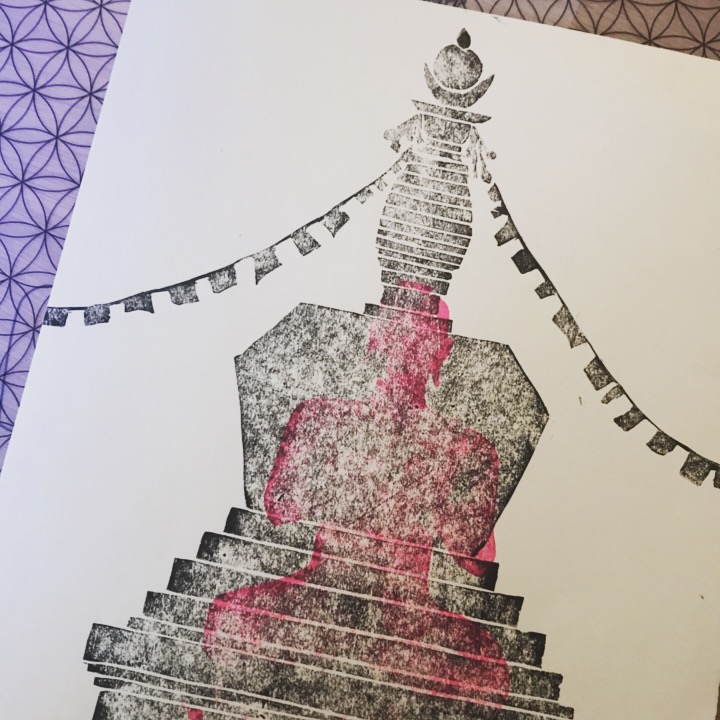
The Great Stupa of Dharmakaya in Red Feather Lakes, Colorado is high on the list of favorite places. I went there one summer when I lived in Denver, while attending a music fest near by. It left a huge happy impression on my heart. In my search for what I love I remembered I loved this place SO MUCH. I’ve been doing a lot of yoga and it just came together to make this.
The stupa is the only one of its kind in Northern America. It stands 108 feet tall, and has an 18 ft. tall golden buddha in the temple. Its nestled in between a couple of small ranges, and you can feel the energy of the place as soon as you park your car. I loved exploring the park area and hike to the stupa, and the temple was awe inspiring. I hope to go back and visit soon, and take them a print!
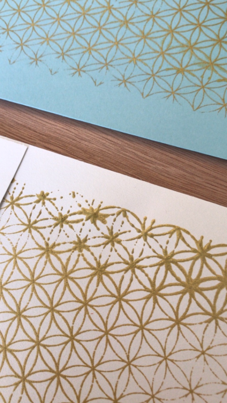
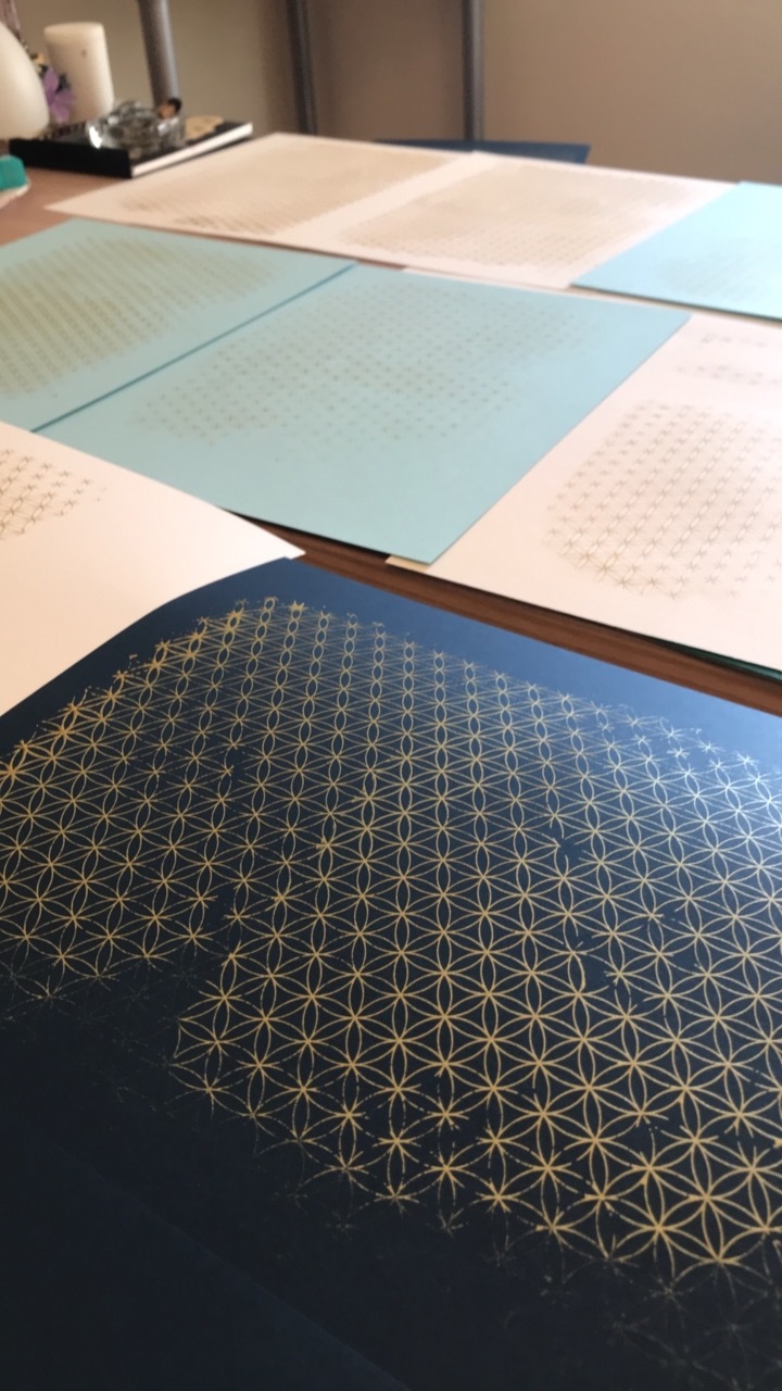
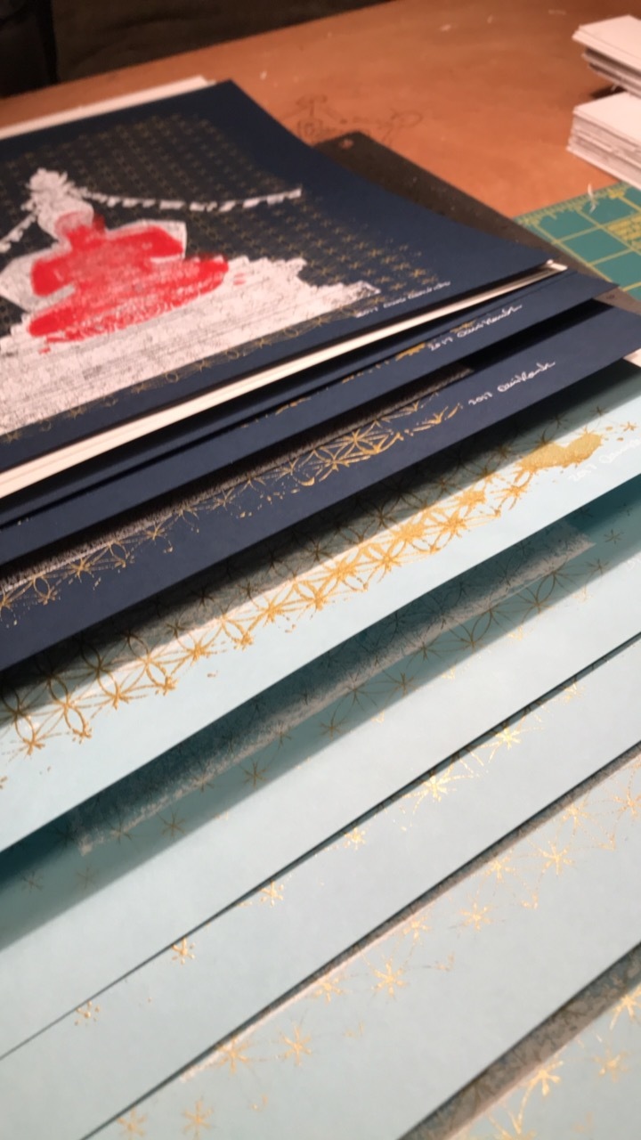
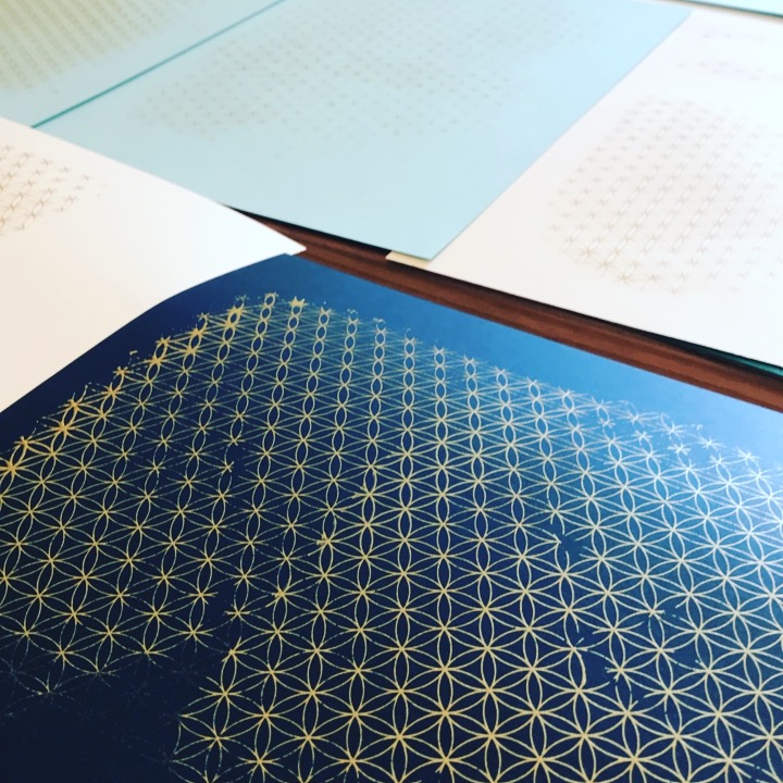
The first edition of final prints are in blues, gold, red and white. I am thinking up a color scheme to go on some new green paper I have. They will be available on this site soon, and at select stores around the Cadillac area.
Charmellow is Handmade
As the title says, Charmellow Design is very much homegrown, down to earth, handmade company. I started it myself, I make everything myself. But what I do in graphic design land is very much inspired by what I make at home.
I’m constantly creating things. I don’t spend a lot of daylight hours watching TV or relaxing. I actually can’t relax, I’ve learned. I feel best when I am using my hands, doing something. Using my brain at least engaged in a game. I have a dining room at home that is the headquarters to weekly Collage Night, and a table full of crafty stuff just waiting to be put to use.
I have drawn, colored and collaged from an early age like many artists I know. In high school I took “art class,” photography and newspaper. At community college I took life drawing, printmaking, perspective drawing and advertising classes. At art school, heh, I feel like I got to take almost all of the “holy grail” classes I could imagine. My all time favorite was Book Arts which involved a ton of awesome, I want all of them, printing techniques. I still love making books so much.
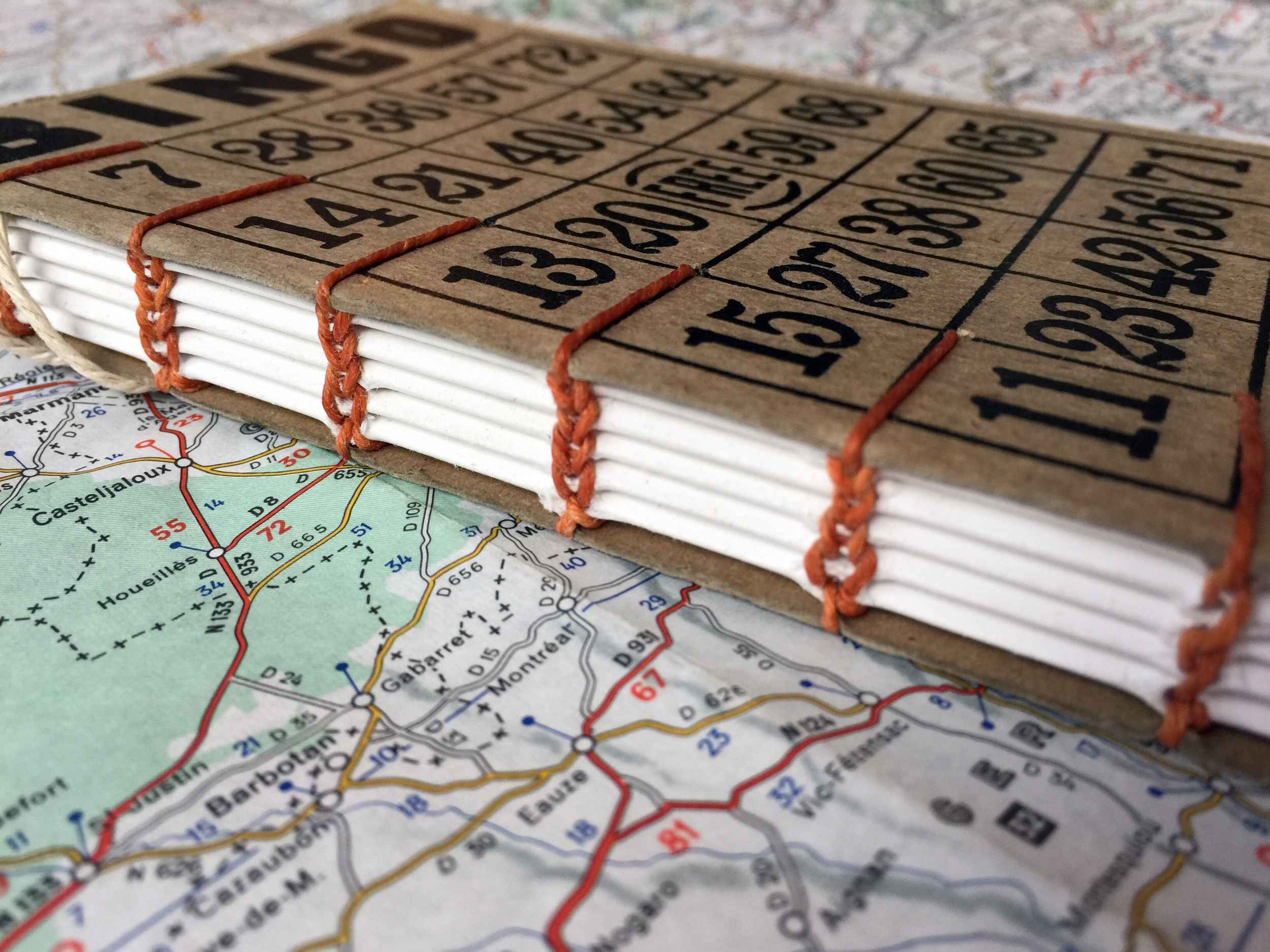
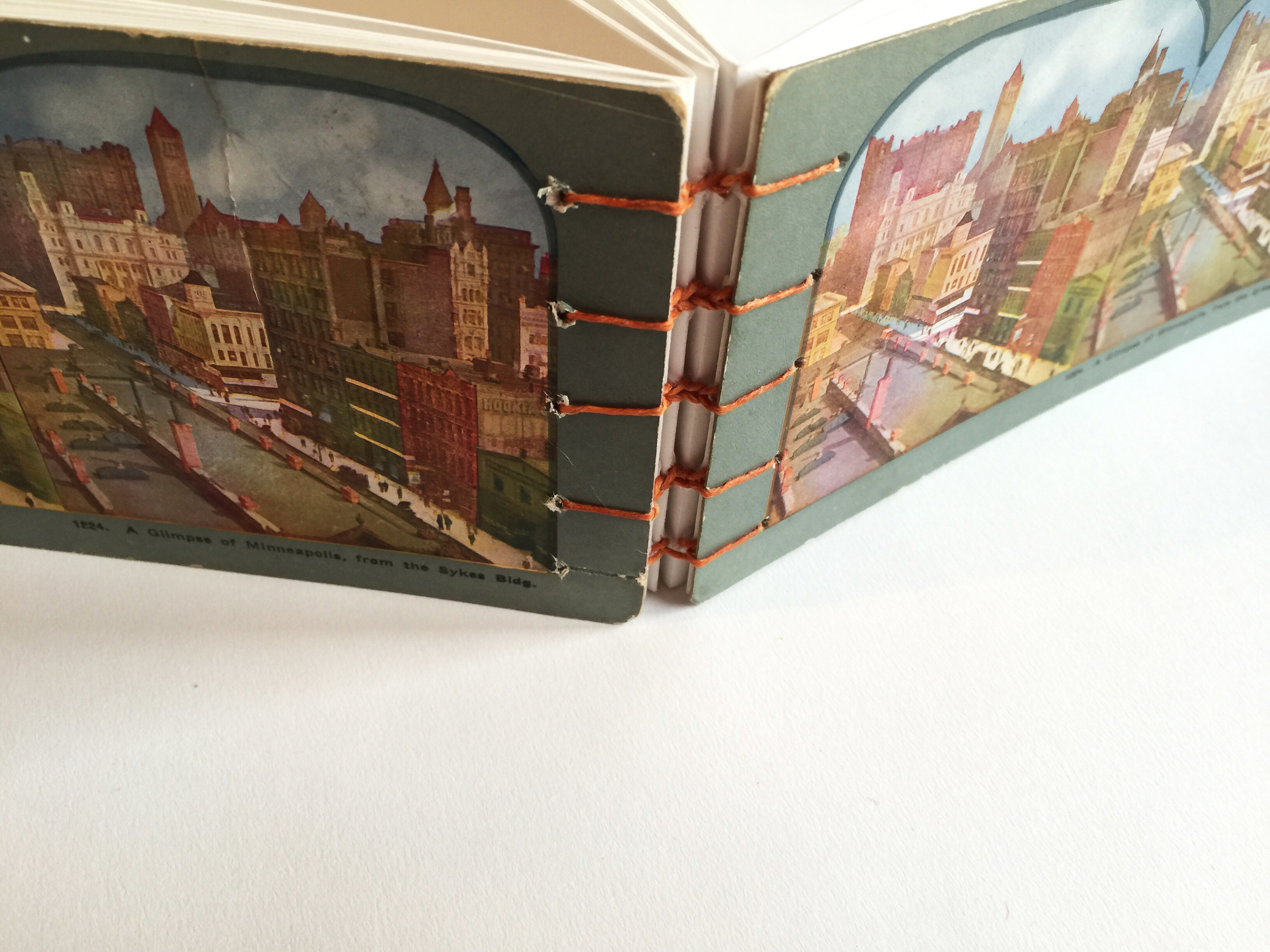
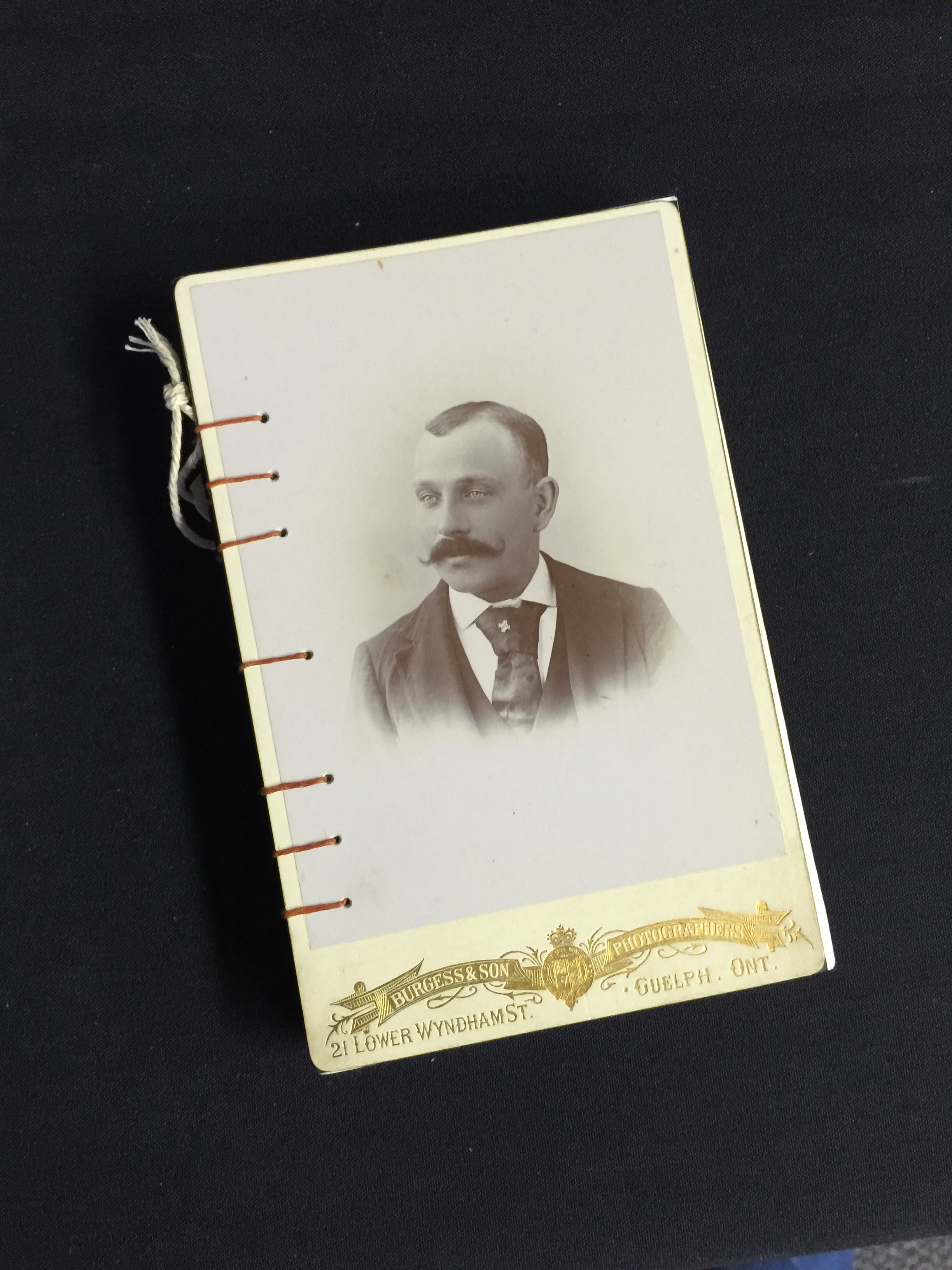
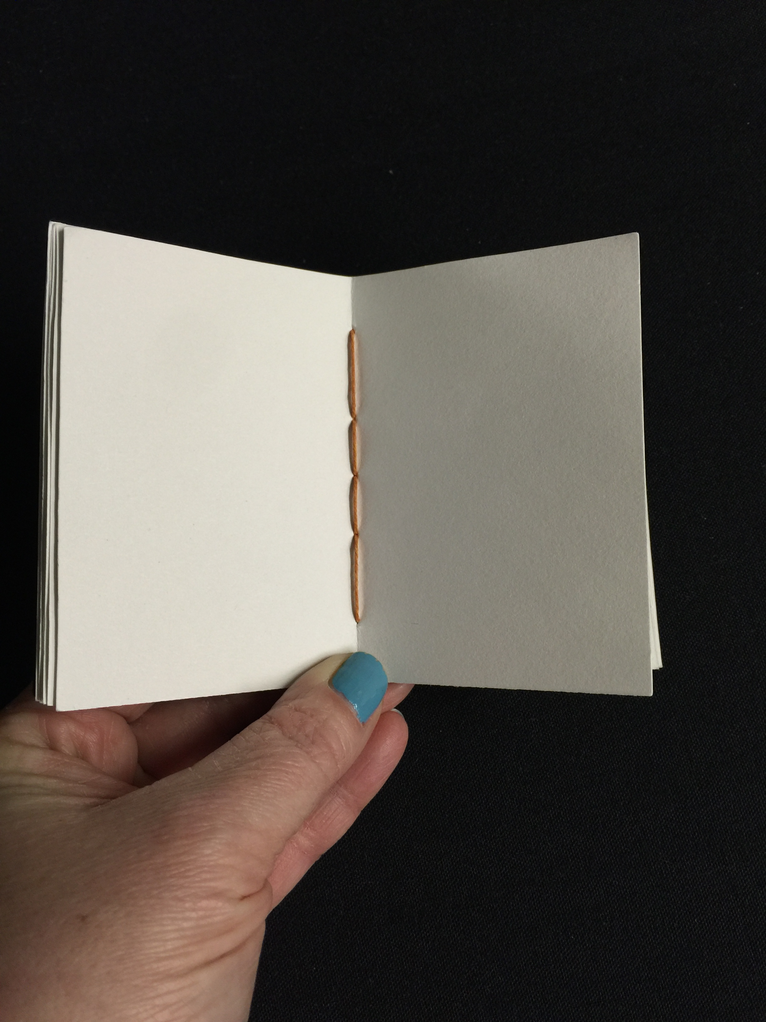
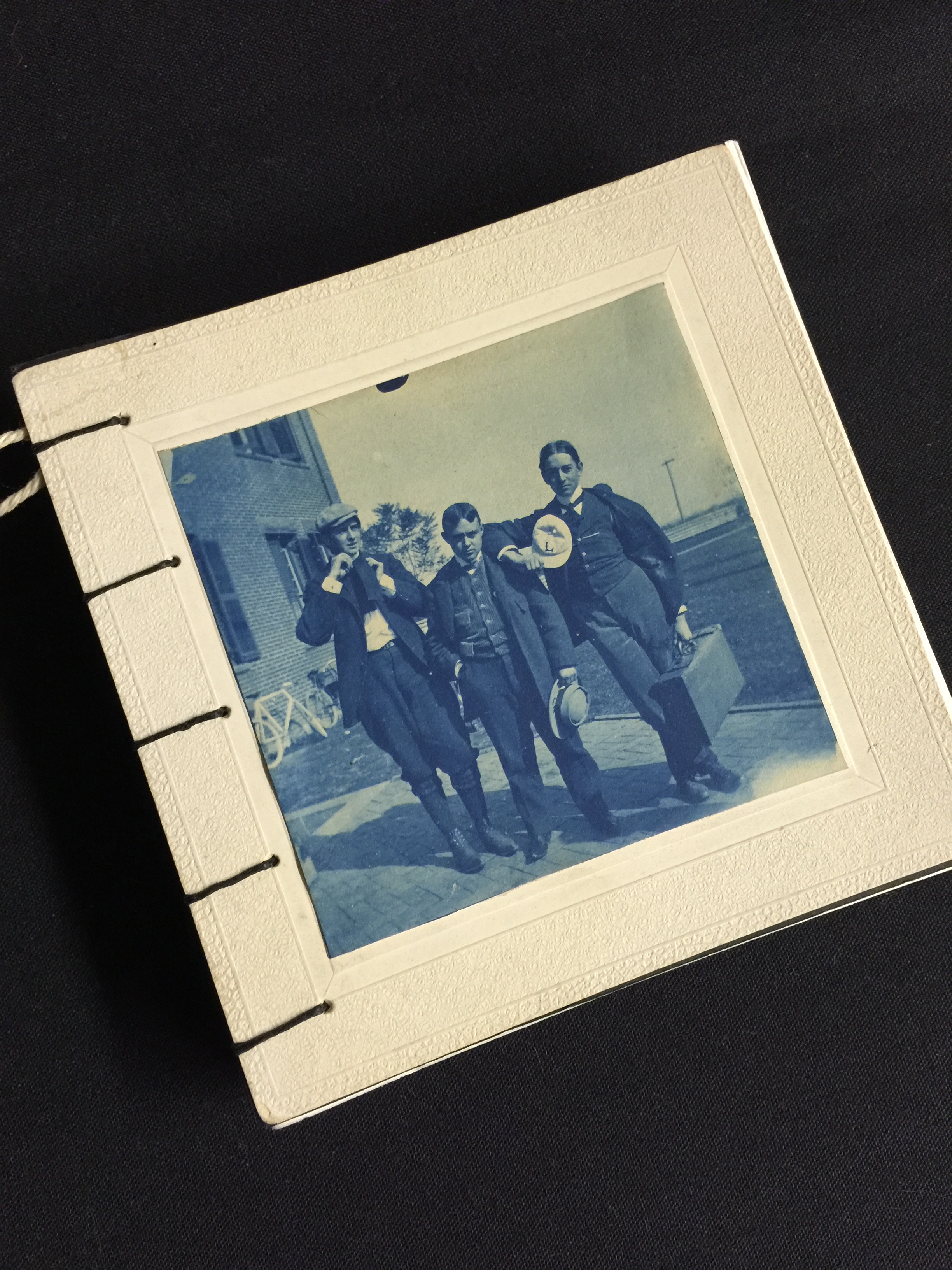
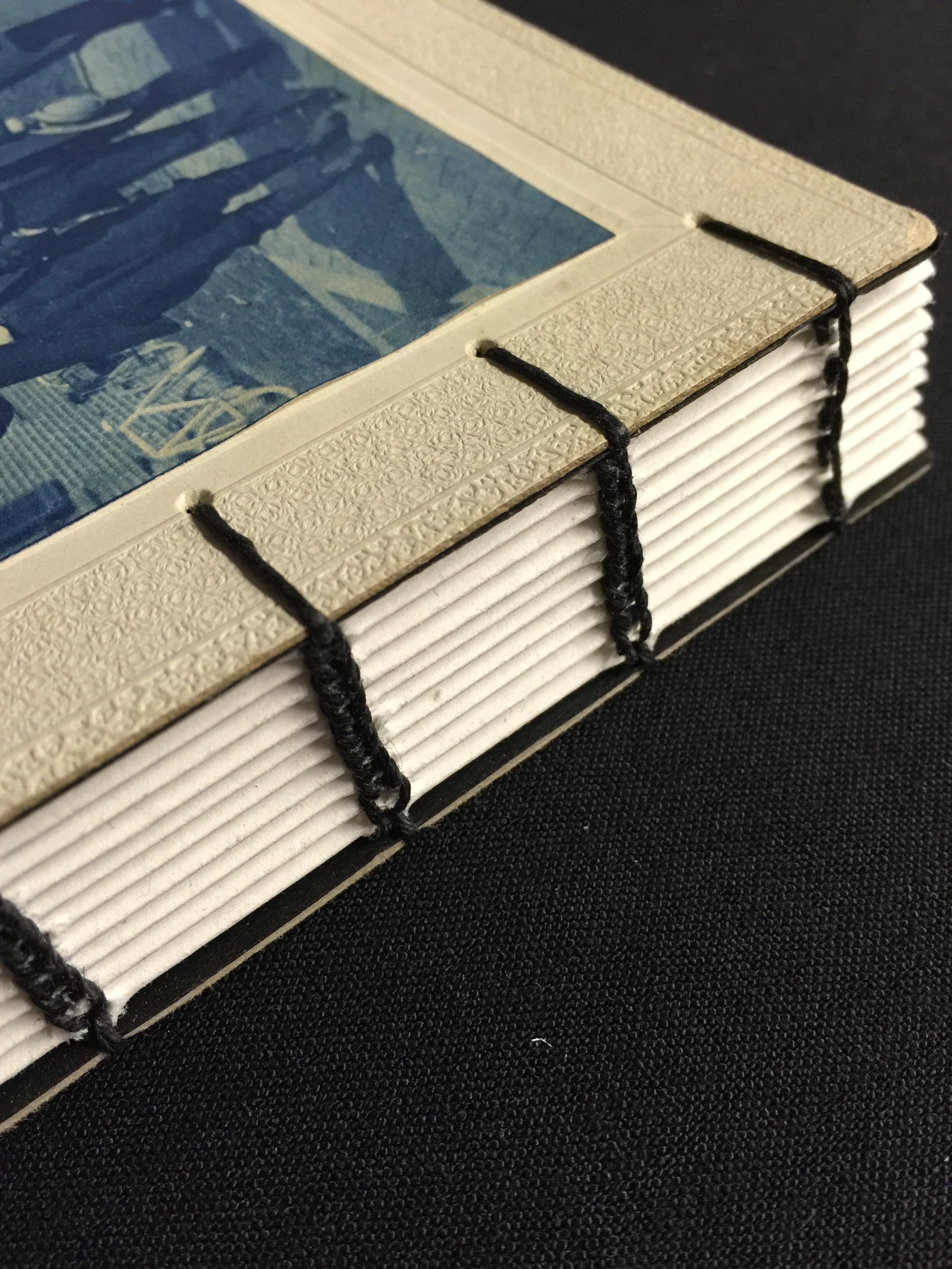
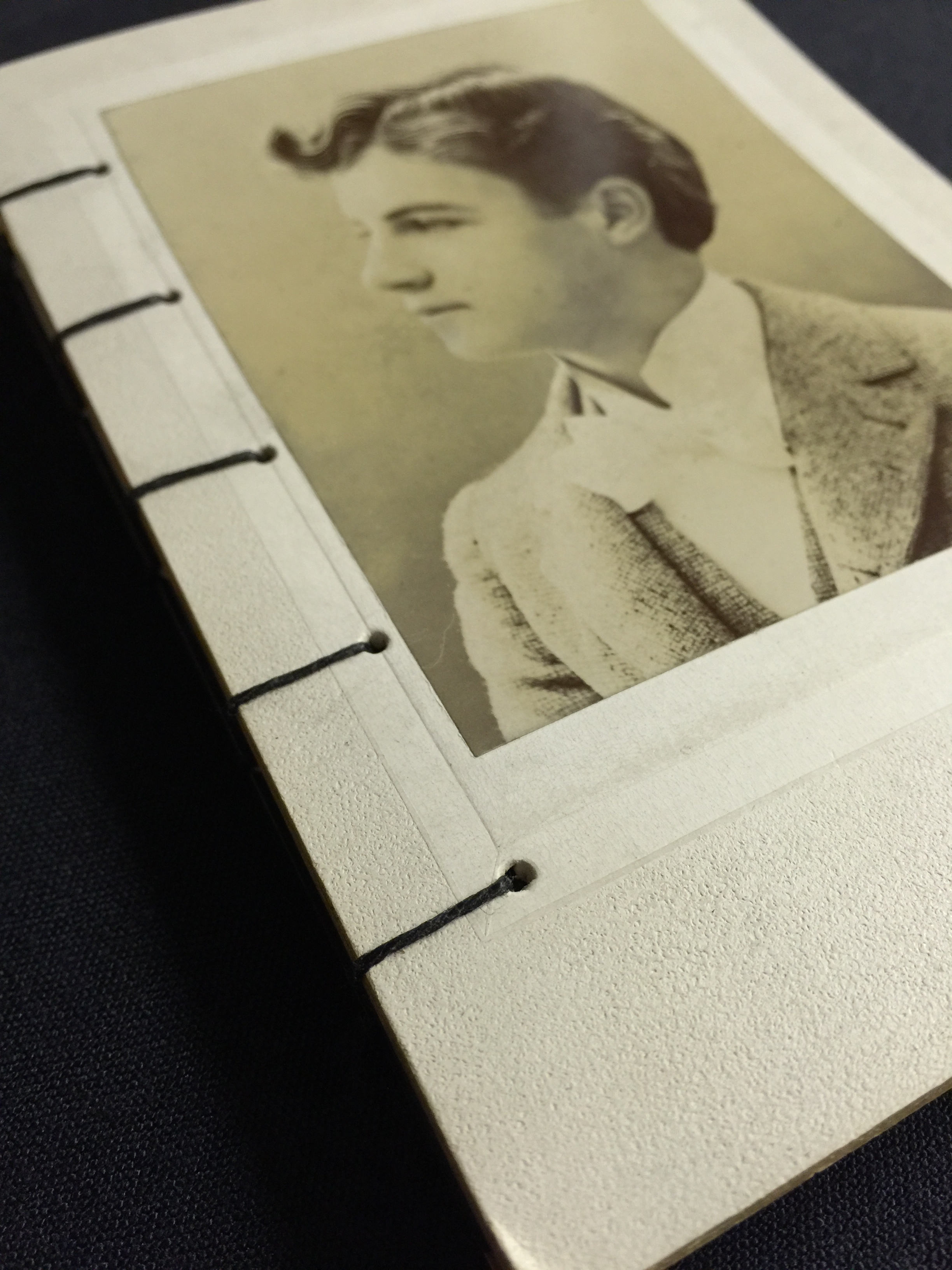
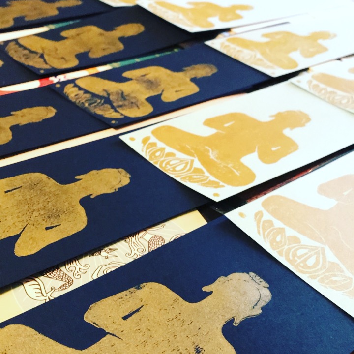
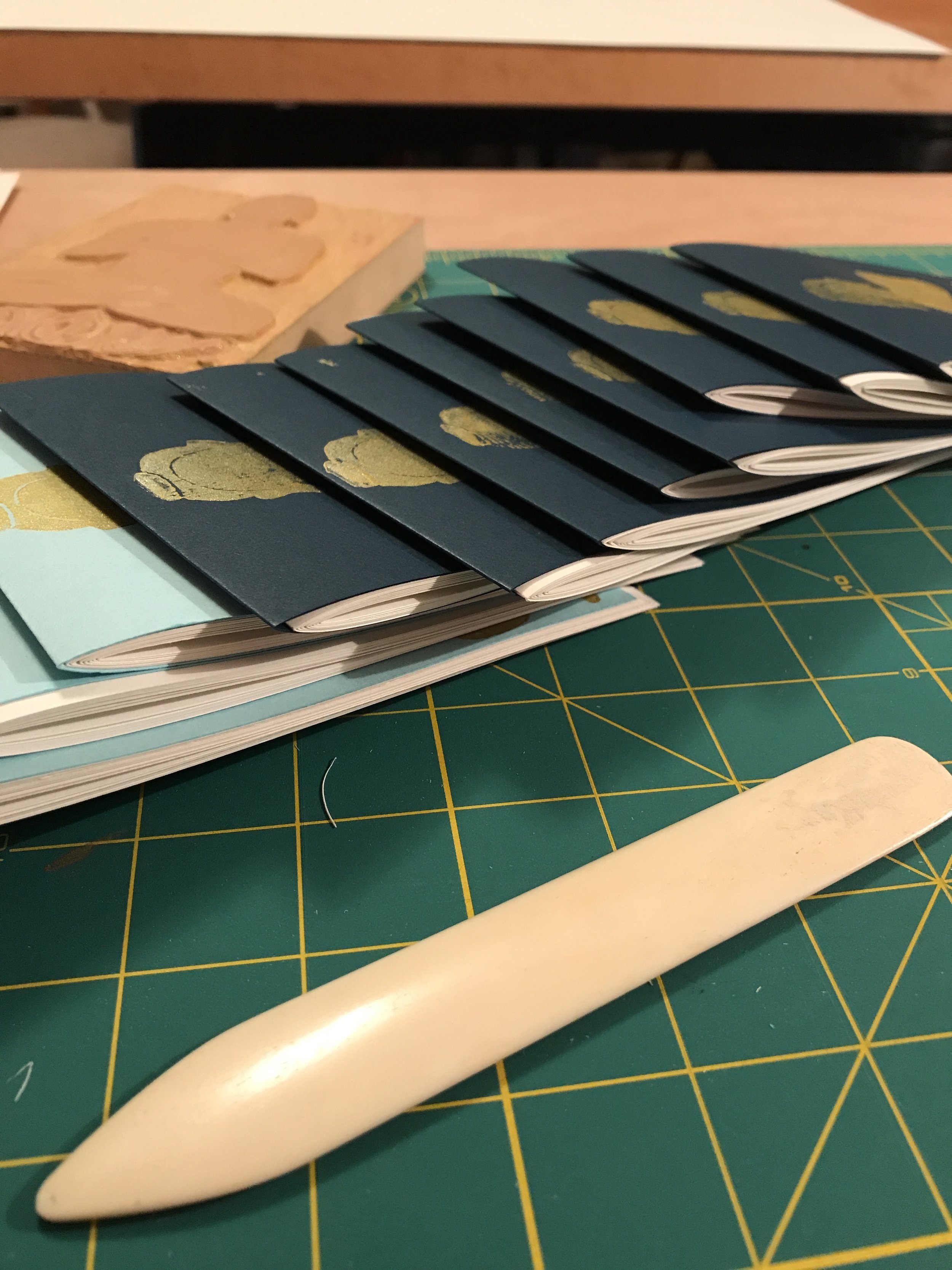
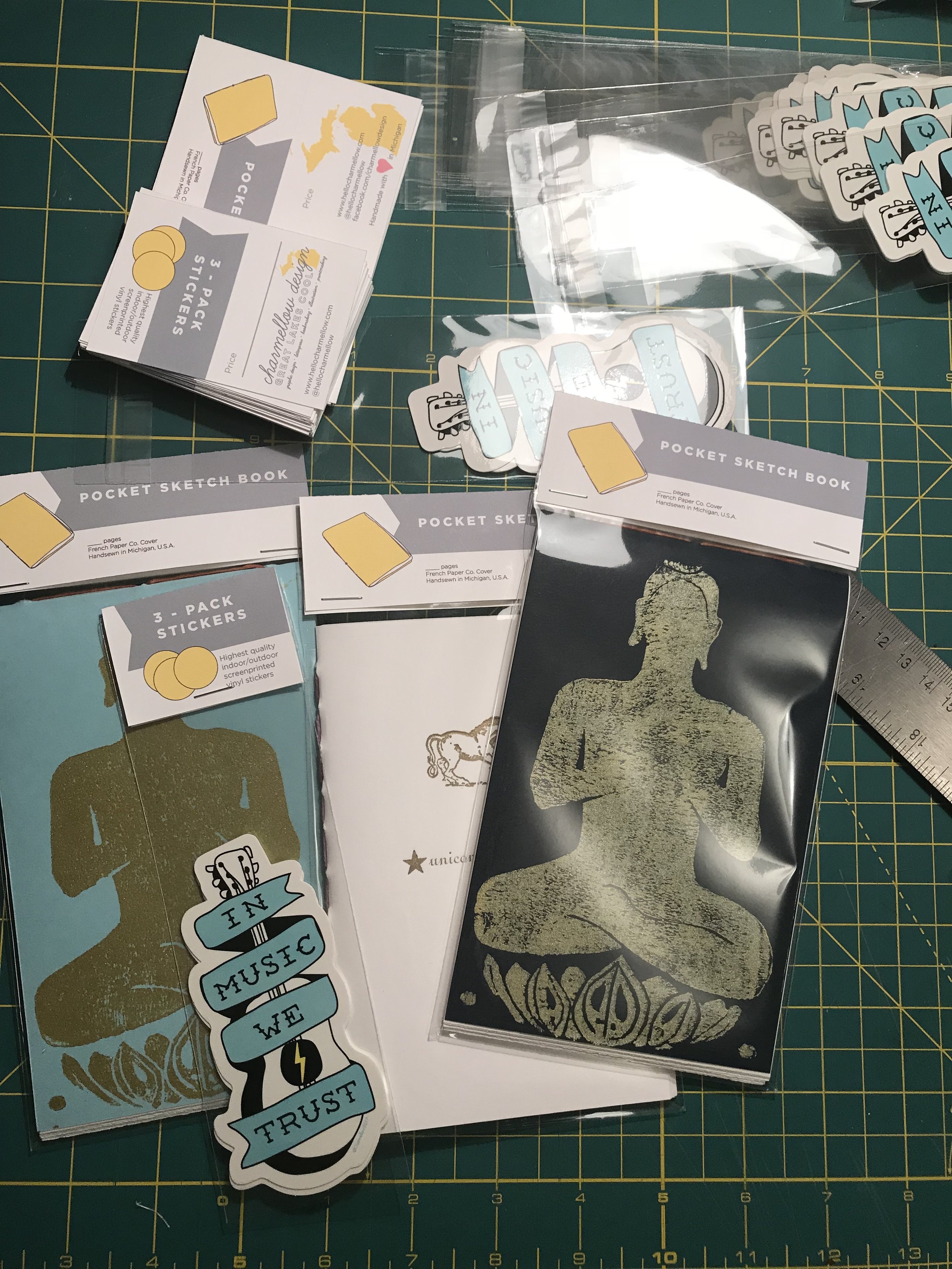
So this story is dedicated to that, and shamelessly plugging the Etsy shop where I sell my one of a kind pieces. I cut, fold, punch holes and sew every book completely by hand. In Michigan. Where winter is long and cold. Just kidding, its not really THAT ominous...
The reason this is important to what I do for businesses that hire me to do graphic design, is because designing things is truly a way of life for me. I make books, screen print posters, carve my own stamp ideas for printing, draw almost every day… For fun. I love the arts. I love creating meaning and bringing life into lines and brushstrokes.
If you think about it, that’s what graphic design does for business, too. When I am making a logo for someone, I’m researching and learning about their business. I am learning the ins and outs, the goals, passions and favorite colors. I am tapping into what makes that business unique, and then I am telling everyone that story with their identity system. I am making a logo that is bursting with the who, what and why of your company.
Story telling is what its all about. I believe that the books I make, the logos, the websites I’ve made and the posters I labor over tell the story of who I am. A story teller.
Here are some pics of some of my favorite books I’ve made recently. And click HERE for my Etsy shop.
The Making of Event Artwork
Hoxeyville Music Festival 2016
Its February in Northern Michigan, which means that winter is still clinging to life mercilessly. A small group of people have been quietly, albeit busily working behind the scenes to launch this year’s Hoxeyville Festival line-up. I work remotely from the producers and create the carefully tuned artwork theme for the year in the cold months of winter. I suppose probably the thought of those dog days of summer drives the motivation, that somehow finishing this artwork will bring sooner summer temps.
This year was unlike and just like the past years of festival prep. Jake Robinson and I sat down for a number of brainstorm sessions before deciding on this years vintage wooden amp theme.
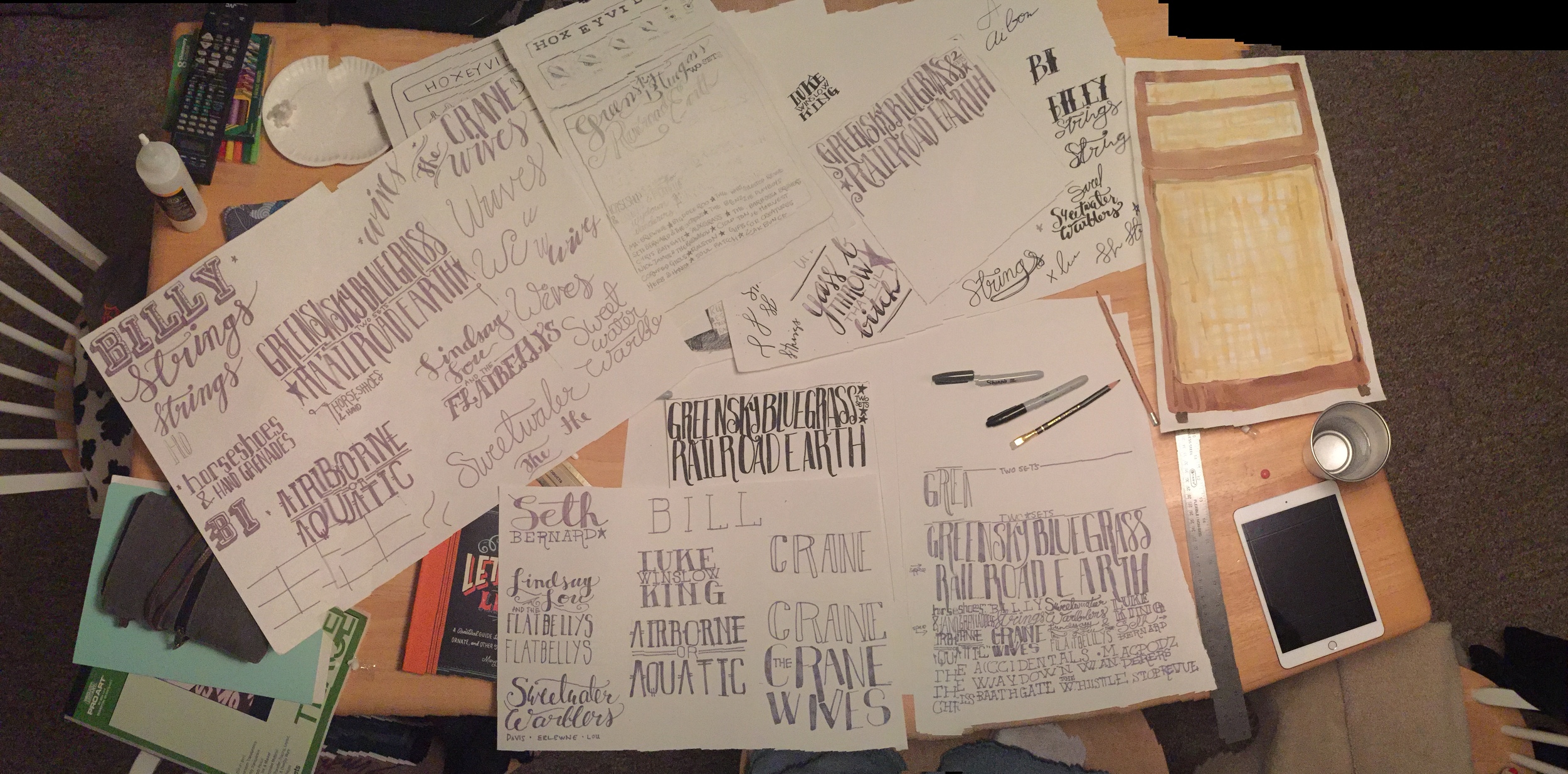
I got to work lettering bands, testing out watercolors, researching and drawing amps, lettering more bands or lettering bands again.
Once we had all the pieces, I was able to scan, rescan and start digitizing the hand done art I had made. The hand lettering has to be digital, so that was taken into Adobe Illustrator and vectorized. The water color had to be cleaned up and detail added by way of woodgrain art, watercolor and some photoshop magic.
Once the amp was all made and the bands laid out all legibly, it was time to apply the art to the actual pieces we need to use to market the festival. We are after all, selling tickets. Over time our marketing efforts have turned over from word of mouth, paper handbills, posters and our fans to social media. We do still print posters, but that is much more of a locally targeted audience closer to the festival.
Facebook and Instagram are primary outlets that reach thousands of people we otherwise wouldn’t reach. The format for those are square, shareable images. So I set up the print poster first, since that is the largest format we will have for now. I get all the info on there looking svelt. Then I created the social share images. Our main object is an amp, so I set it in some purposely plainly designed settings that look like a living room. I added a cord and some letterpress style texture to the background to help the amp tell more of a story.
There are rules for advertising on Facebook, so one image is designed within the 20% text rule, and the other shows all the art, all the text and info. It becomes more shareable.
In addition to making different shareable pieces, internally our marketers and web people need a kit of elements to keep things fresh during the next six months of advertising. I supply backgrounds and elements to help those guys keep the marketing consistently vibed and fresh.
Then we launch our baby into the world. It looks like it took no effort at all, and seamlessly announces the line-up across all outlets and media.
Le sigh. Like seeing your little baby all grown up.
Case Study: Greensky Bluegrass Website & Artwork
Greensky Bluegrass Website
Greensky Bluegrass is my favorite band and a nationally touring sell-out every show bluegrass act. They originate from my home land of Michigan, and are now headlining shows all over this great country. Our relationship started when they asked me to design them a Summer Tour shirt in 2014. Then they asked me to redesign their website, working with a developer to create an all new greenskybluegrass.com.
They needed a new site design that visually represents them and all five guys. Their previous site functioned,but lacked any kind of personality. The new site had to encompass the same functionality and function in a mobile capacity. We went through a number of designs that were nice, but really didn’t encompass all the originality, heart, travel, lyrics and oddities of life that this band so appropriately captures in their songs.
I went out on a shaky limb and provided the management a funky half-man, half-wolf design that collaged vintage oddities with hand drawn items, places, people, marquees. What surfaced from that intense collaginating was a new hand-drawn logo and vibe. Each page features a different header that shows different scenarios and vintage fantasies. These guys have imagination, hopes, dreams and musical vision like we see in famous hard working bands. This site works to represent all of those things as well as song lyrics and my personal inner fan girl perspective.
Ultimately the limb held up and my design went over quite well with fans and other bands. The band is able to feature new downloads, merchandise and press in a fashionable yet whimsical way. We have taken pieces of the collage and hand drawn logo and used them on Fall 2015/Winter 2016 Downloads, and all print and digital promotions around the country. People steal these posters and handbills off the walls and post them on social media like trophys. That feels pretty good.
Let's connect!

