Gopherwood Concerts Posters 2015/2016 Season
When I started Charmellow, I had 2 clients and a half a sandwich. Just kidding, but really not much more than that. I needed to network and began volunteering for local nonprofits and event committees. I found out that I really like helping local places do a better job of getting the word out about their awesome causes.
Gopherwood Concerts is a nonprofit that brings musicians, both local and national, to our little town. Artists such as Joshua Davis (from NBC's The Voice), Rachael Davis, Willy Porter, The Sweet Water Warblers and so many more talented peeps have graced the stage of the Cadillac Elks Lodge. I am excited to have donated my expertise to such a great cause.
Here are a few of my favorite posters from this years series. Check them out on their Facebook Page if you feel like catching a show next season.
The Making of Event Artwork
Hoxeyville Music Festival 2016
Its February in Northern Michigan, which means that winter is still clinging to life mercilessly. A small group of people have been quietly, albeit busily working behind the scenes to launch this year’s Hoxeyville Festival line-up. I work remotely from the producers and create the carefully tuned artwork theme for the year in the cold months of winter. I suppose probably the thought of those dog days of summer drives the motivation, that somehow finishing this artwork will bring sooner summer temps.
This year was unlike and just like the past years of festival prep. Jake Robinson and I sat down for a number of brainstorm sessions before deciding on this years vintage wooden amp theme.
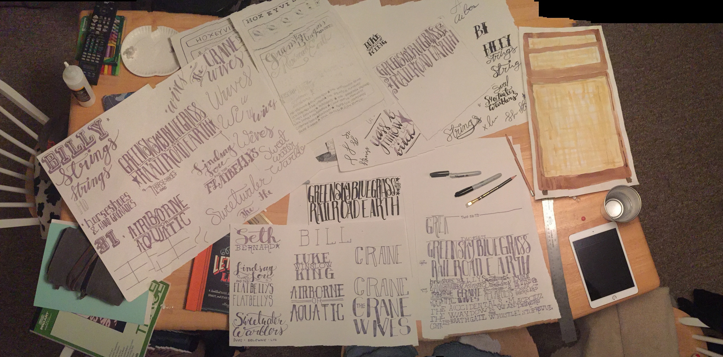
I got to work lettering bands, testing out watercolors, researching and drawing amps, lettering more bands or lettering bands again.
Once we had all the pieces, I was able to scan, rescan and start digitizing the hand done art I had made. The hand lettering has to be digital, so that was taken into Adobe Illustrator and vectorized. The water color had to be cleaned up and detail added by way of woodgrain art, watercolor and some photoshop magic.
Once the amp was all made and the bands laid out all legibly, it was time to apply the art to the actual pieces we need to use to market the festival. We are after all, selling tickets. Over time our marketing efforts have turned over from word of mouth, paper handbills, posters and our fans to social media. We do still print posters, but that is much more of a locally targeted audience closer to the festival.
Facebook and Instagram are primary outlets that reach thousands of people we otherwise wouldn’t reach. The format for those are square, shareable images. So I set up the print poster first, since that is the largest format we will have for now. I get all the info on there looking svelt. Then I created the social share images. Our main object is an amp, so I set it in some purposely plainly designed settings that look like a living room. I added a cord and some letterpress style texture to the background to help the amp tell more of a story.
There are rules for advertising on Facebook, so one image is designed within the 20% text rule, and the other shows all the art, all the text and info. It becomes more shareable.
In addition to making different shareable pieces, internally our marketers and web people need a kit of elements to keep things fresh during the next six months of advertising. I supply backgrounds and elements to help those guys keep the marketing consistently vibed and fresh.
Then we launch our baby into the world. It looks like it took no effort at all, and seamlessly announces the line-up across all outlets and media.
Le sigh. Like seeing your little baby all grown up.
Case Study: Greensky Bluegrass Website & Artwork
Greensky Bluegrass Website
Greensky Bluegrass is my favorite band and a nationally touring sell-out every show bluegrass act. They originate from my home land of Michigan, and are now headlining shows all over this great country. Our relationship started when they asked me to design them a Summer Tour shirt in 2014. Then they asked me to redesign their website, working with a developer to create an all new greenskybluegrass.com.
They needed a new site design that visually represents them and all five guys. Their previous site functioned,but lacked any kind of personality. The new site had to encompass the same functionality and function in a mobile capacity. We went through a number of designs that were nice, but really didn’t encompass all the originality, heart, travel, lyrics and oddities of life that this band so appropriately captures in their songs.
I went out on a shaky limb and provided the management a funky half-man, half-wolf design that collaged vintage oddities with hand drawn items, places, people, marquees. What surfaced from that intense collaginating was a new hand-drawn logo and vibe. Each page features a different header that shows different scenarios and vintage fantasies. These guys have imagination, hopes, dreams and musical vision like we see in famous hard working bands. This site works to represent all of those things as well as song lyrics and my personal inner fan girl perspective.
Ultimately the limb held up and my design went over quite well with fans and other bands. The band is able to feature new downloads, merchandise and press in a fashionable yet whimsical way. We have taken pieces of the collage and hand drawn logo and used them on Fall 2015/Winter 2016 Downloads, and all print and digital promotions around the country. People steal these posters and handbills off the walls and post them on social media like trophys. That feels pretty good.
Let's connect!


