The Making of Event Artwork
Hoxeyville Music Festival 2016
Its February in Northern Michigan, which means that winter is still clinging to life mercilessly. A small group of people have been quietly, albeit busily working behind the scenes to launch this year’s Hoxeyville Festival line-up. I work remotely from the producers and create the carefully tuned artwork theme for the year in the cold months of winter. I suppose probably the thought of those dog days of summer drives the motivation, that somehow finishing this artwork will bring sooner summer temps.
This year was unlike and just like the past years of festival prep. Jake Robinson and I sat down for a number of brainstorm sessions before deciding on this years vintage wooden amp theme.


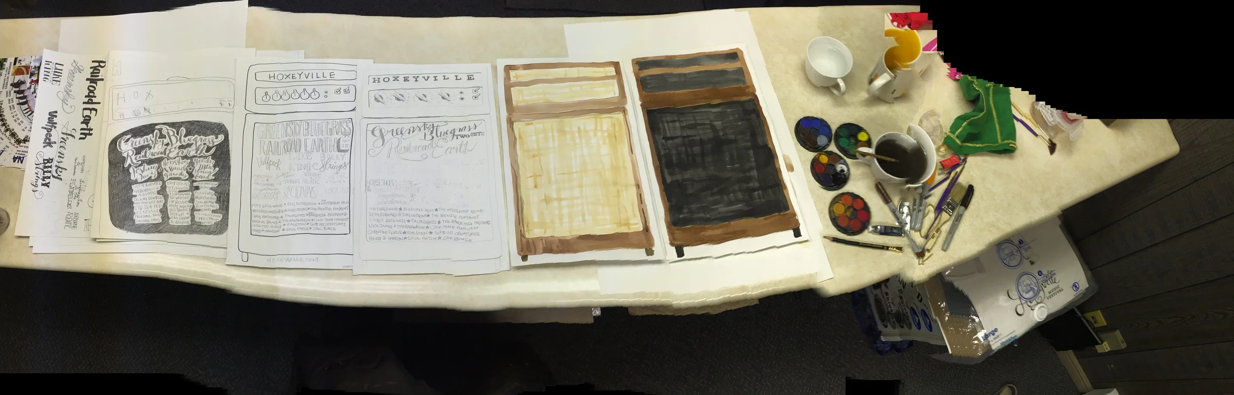
I got to work lettering bands, testing out watercolors, researching and drawing amps, lettering more bands or lettering bands again.
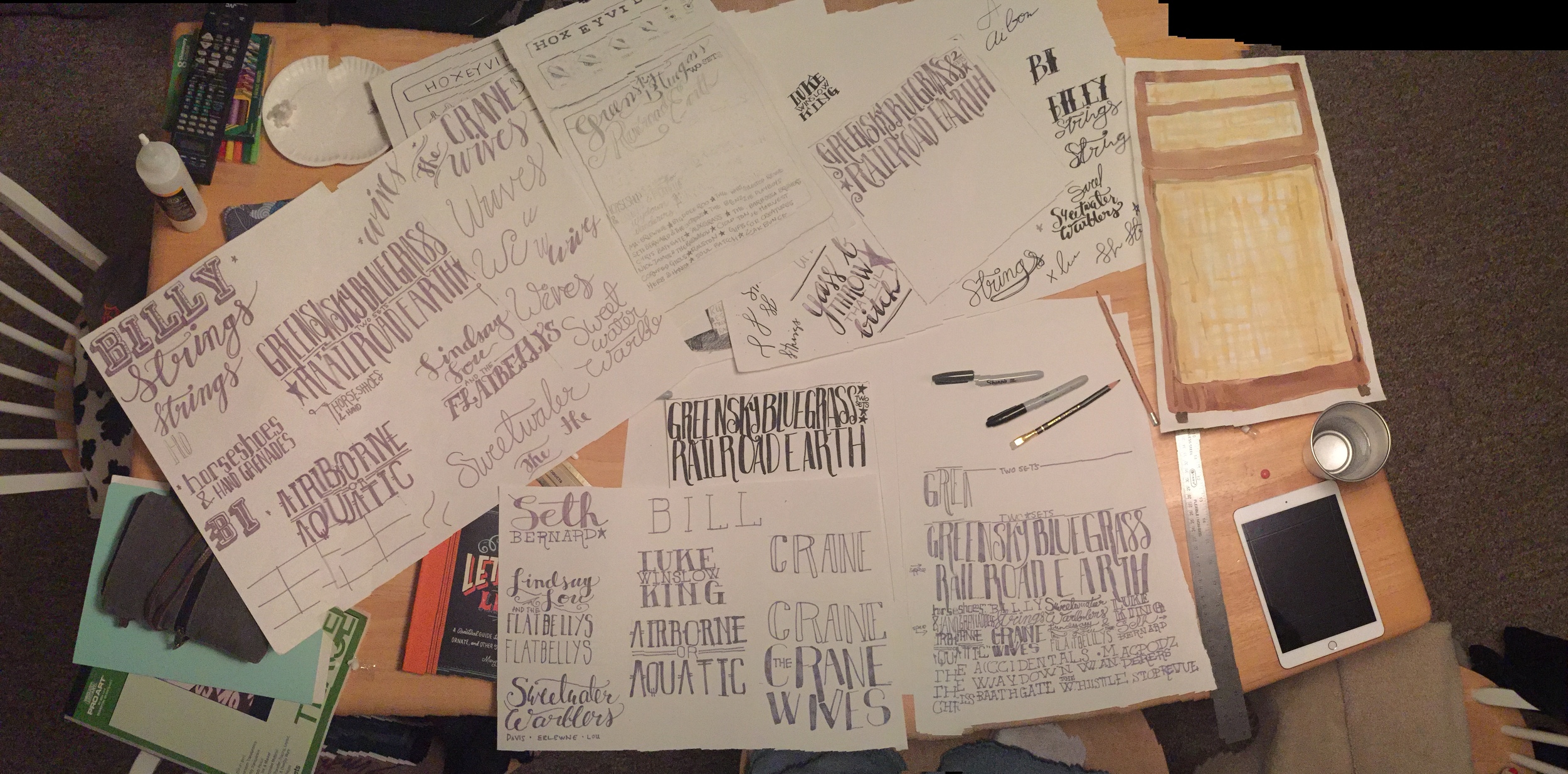
Once we had all the pieces, I was able to scan, rescan and start digitizing the hand done art I had made. The hand lettering has to be digital, so that was taken into Adobe Illustrator and vectorized. The water color had to be cleaned up and detail added by way of woodgrain art, watercolor and some photoshop magic.
Once the amp was all made and the bands laid out all legibly, it was time to apply the art to the actual pieces we need to use to market the festival. We are after all, selling tickets. Over time our marketing efforts have turned over from word of mouth, paper handbills, posters and our fans to social media. We do still print posters, but that is much more of a locally targeted audience closer to the festival.
Facebook and Instagram are primary outlets that reach thousands of people we otherwise wouldn’t reach. The format for those are square, shareable images. So I set up the print poster first, since that is the largest format we will have for now. I get all the info on there looking svelt. Then I created the social share images. Our main object is an amp, so I set it in some purposely plainly designed settings that look like a living room. I added a cord and some letterpress style texture to the background to help the amp tell more of a story.
There are rules for advertising on Facebook, so one image is designed within the 20% text rule, and the other shows all the art, all the text and info. It becomes more shareable.
In addition to making different shareable pieces, internally our marketers and web people need a kit of elements to keep things fresh during the next six months of advertising. I supply backgrounds and elements to help those guys keep the marketing consistently vibed and fresh.

Then we launch our baby into the world. It looks like it took no effort at all, and seamlessly announces the line-up across all outlets and media.
Le sigh. Like seeing your little baby all grown up.