Local Artist Feature
Back in January, local news show 9&10 News The Four reached out to me to do a feature about my artwork. They came to my house and interviewed me about my block printing and artistic process. Watch here!
3 Tips for Providing Your Designer with Feedback
Working with a designer should be a fun and engaging experience. All design is a process of research, sketching, designing, refining and redesigning sometimes, until you reach a suitable product. Graphic design like logos and websites are a product of a relationship - you can definitely tell when its good.
Working with a designer should be a fun and engaging experience. All design is a process of research, sketching, designing, refining and redesigning sometimes, until you reach a suitable product. Graphic design like logos and websites are a product of a relationship - you can definitely tell when its good.
1. Do your research.
Not only do you want to properly research the designer you are working with, you should look into your competition locally and nationally to see what you are in for. The designers website, social media accounts and other online presences should look high end they should have recent projects reflecting their skills.
Its a benefit to research your competition to see what they are doing in their business and identity. You don't want to unknowingly copy existing logos or fonts, and its also good to see what they are doing that you do better.
Doing a little research ahead of your design meeting can also help you have a better first conversation. It can help you see what is out there and start to visualize where your business fits into the world.
2. Take the time to communicate.
Designers are not mind readers. Yes, they too should be doing a fair amount of research to learn about you and your business. But its not solely on them for pulling a logo out of thin air. Have a real conversation with your designer and provide them with the emotional connection you feel with your business. Let them know who your clients are, how your sales are and where you are going in the next 5 years. It takes a lot of information to build a logo and identity, so, don't be shy.
When the designer comes back with designs, take the time to have a conversation about them. Think about them, read them and put them up on a wall to look at. Put them under your pillow at night. Design is usually a pretty big investment and your thoughtful feedback is really, really important.
Designers don't expect you to come in speaking their language, but you do need to give feedback that is useful to move forward with. An example:
“I hate option three and I love option 1 and 2. Great work!”
This feedback is almost useless, and I'll explain why. I don't need a pat on the back for work you are paying me to do. I need to know WHAT you hate and love. And WHY. Its helpful to give feedback on the most obvious things, so start there. Leaving your personal preferences out of the conversation is key - because your customers may not have the same taste as you. If you are past the logo stage in business and working on something like a brochure, and have an established brand identity, your personal preference has no stake in the game.
Color, fonts chosen, icons used, style of the illustration are all great things to comment on. Those are things people have an opinion on right away and it can open the conversation into more meaningful discussions. Like if your business started on the back of a buffalo in the the wild, and it should have a buffalo represented... Tell your designer those things up front, it will be so good I promise.
3. Send feedback like a professional.
Feedback is really important. Did I say that already? Okay well, it is. Also being professional and courteous about giving your feedback is important. 9 times out of 10 feedback includes important changes to the design or content like photo swaps or new copy if you are dealing with a brochure or publication, for instance.
The worst thing you can do is assume your designer has time to go through 15 emails to extract single photos. They do not. And you are paying for that time, so its more efficient all around to get your ducks in a row.
When you get feedback, do not reply with off-the-cuff feedback. Wait a couple of days to reply with comments so your feedback isn't in sporadic emails throughout the following days and nights of "OH I JUST THOUGHT OF THIS."
DO REPLY with an immediate, "Got it! Thank you, I will be reviewing this for a couple of days. I'll get back to you."
Compile any written comments and ideas you have right on the PDF using Comments or create a single email to write your comments in as you review the design.
Compile photos you want to send on your computer into a folder. You can do the same when working from a phone.
Also add to this email any website examples, Pinterest boards, or random photo examples.
Basically, put it all together for them. They have created you a thoughtful design, its only respectful to do the same when providing corrections and feedback. It really only takes a bit of organization.
To sum it all up... Be specific. And say what you mean. Your experience will be so great if you can start with conversations and think of hiring a designer as hiring an ally that wants to help you do even better! When your relationship with your designer is open and good, you can accomplish anything in marketing basically. Thanks for reading!
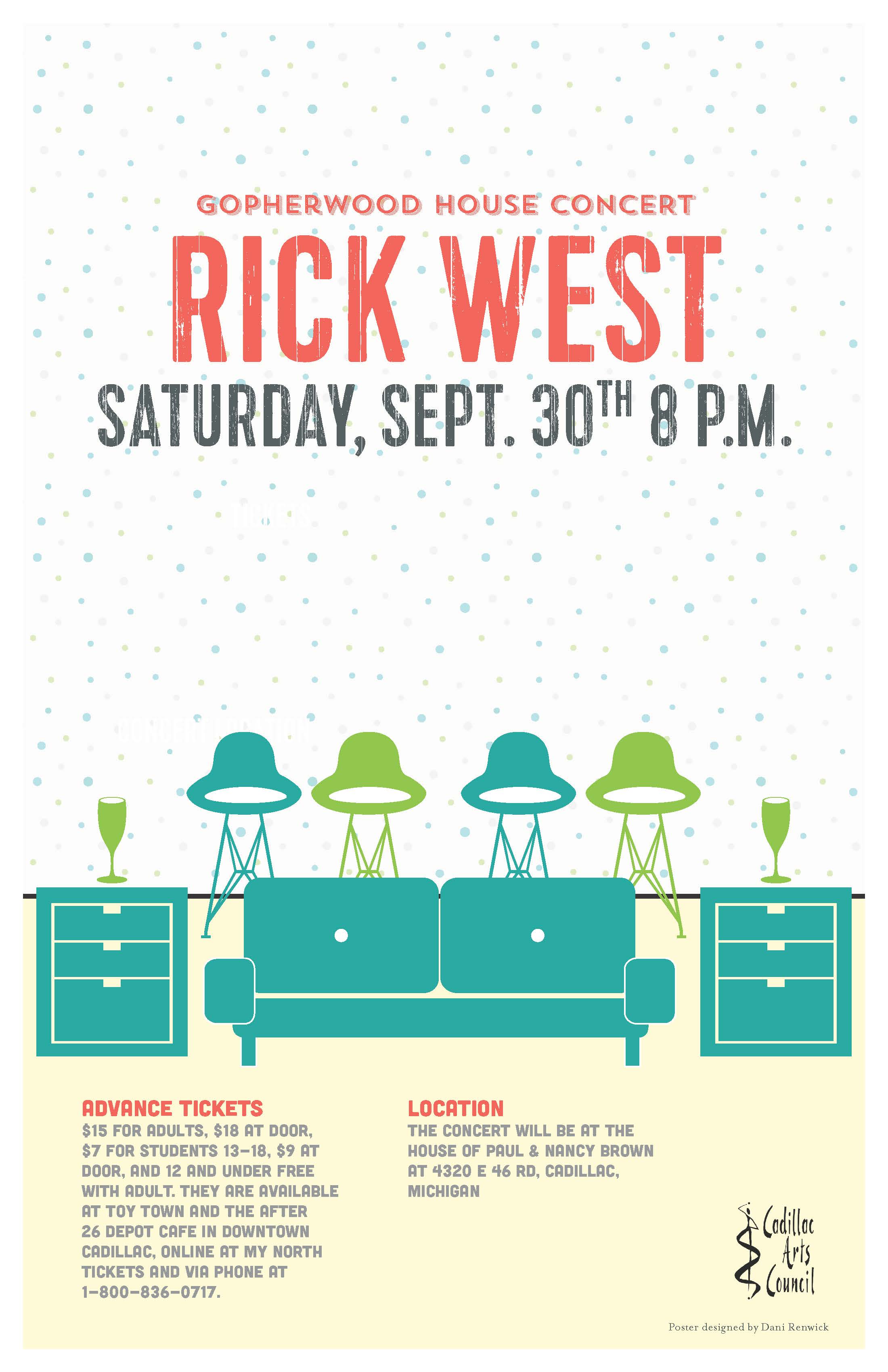
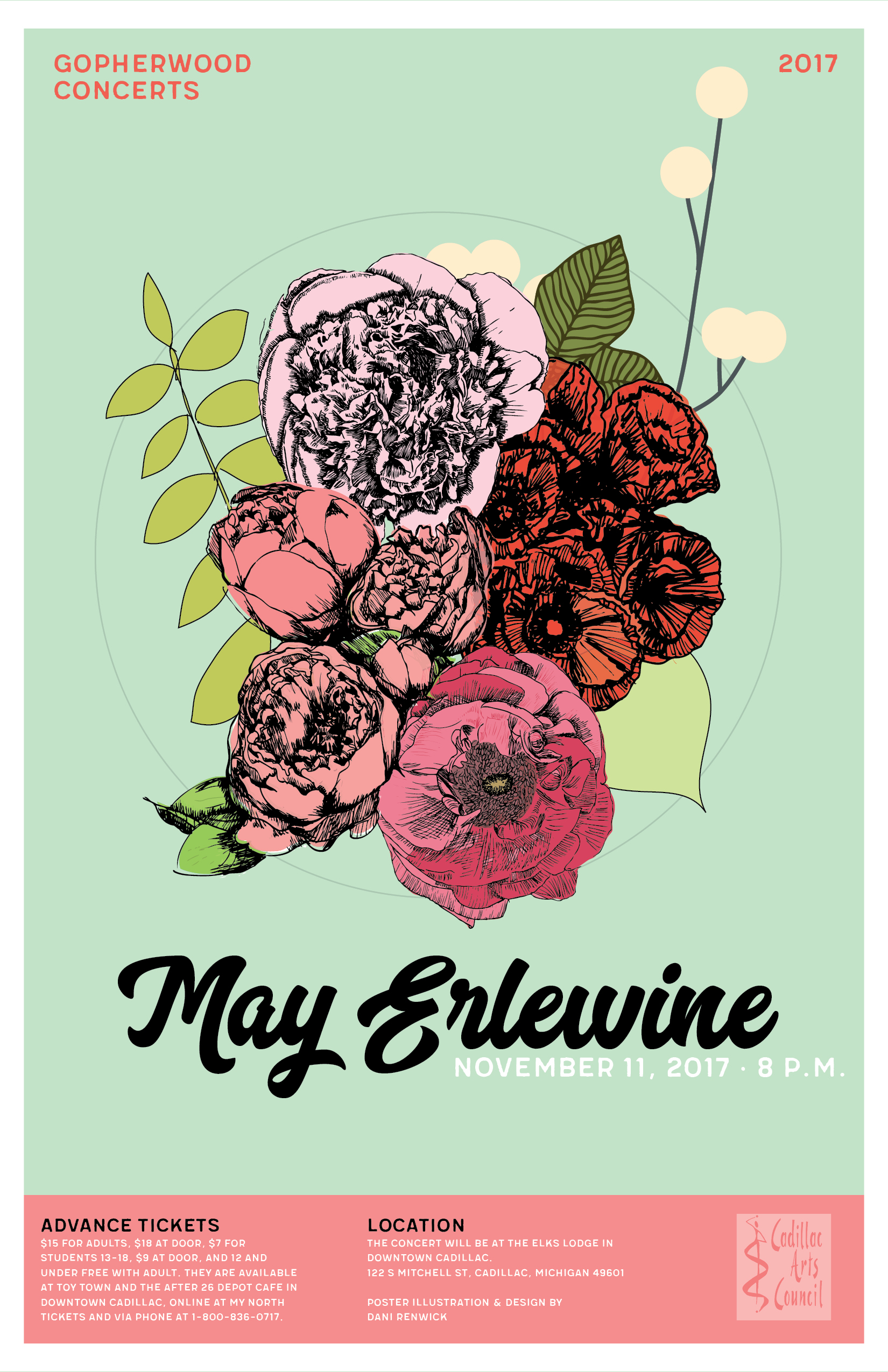
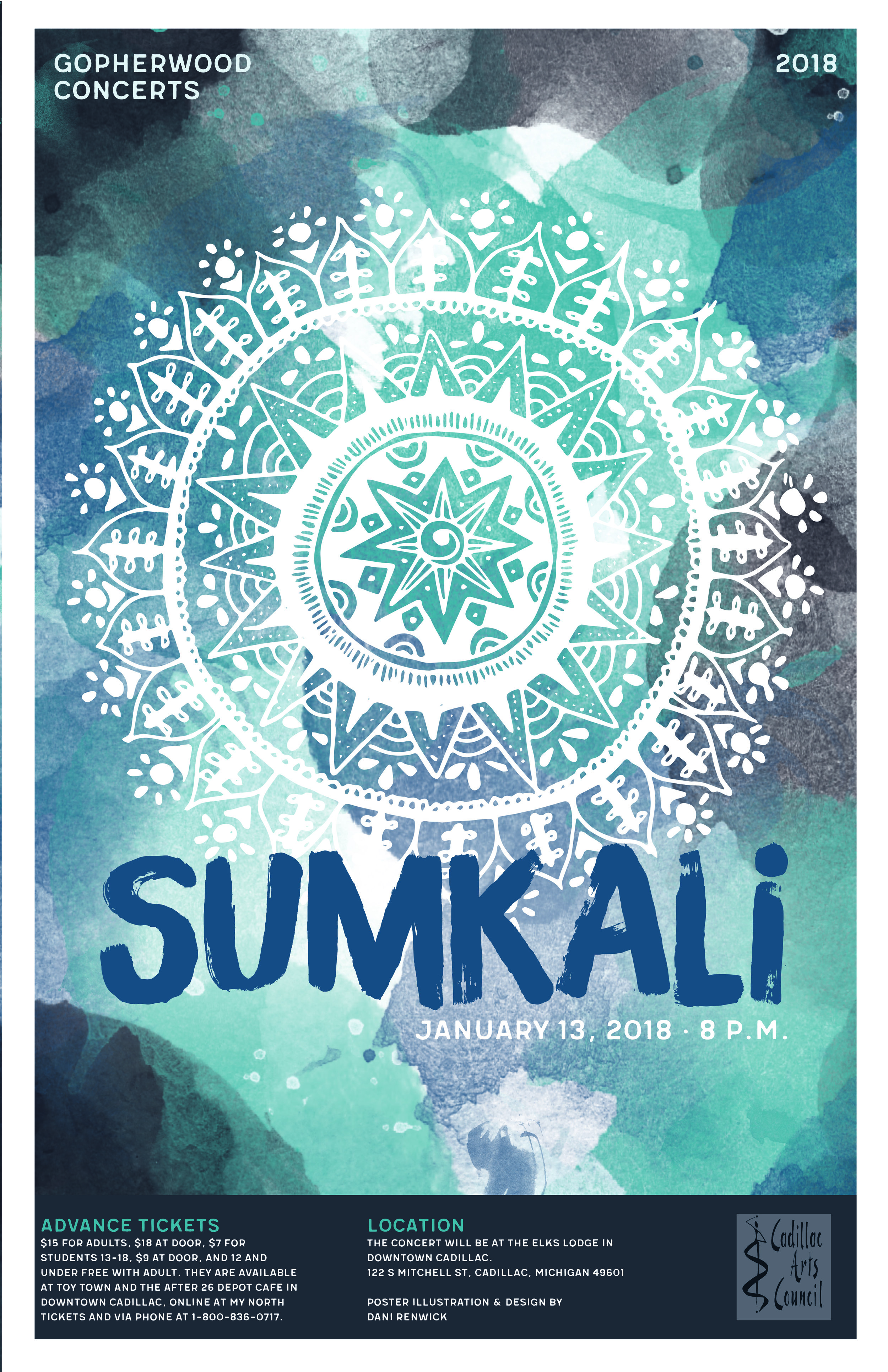
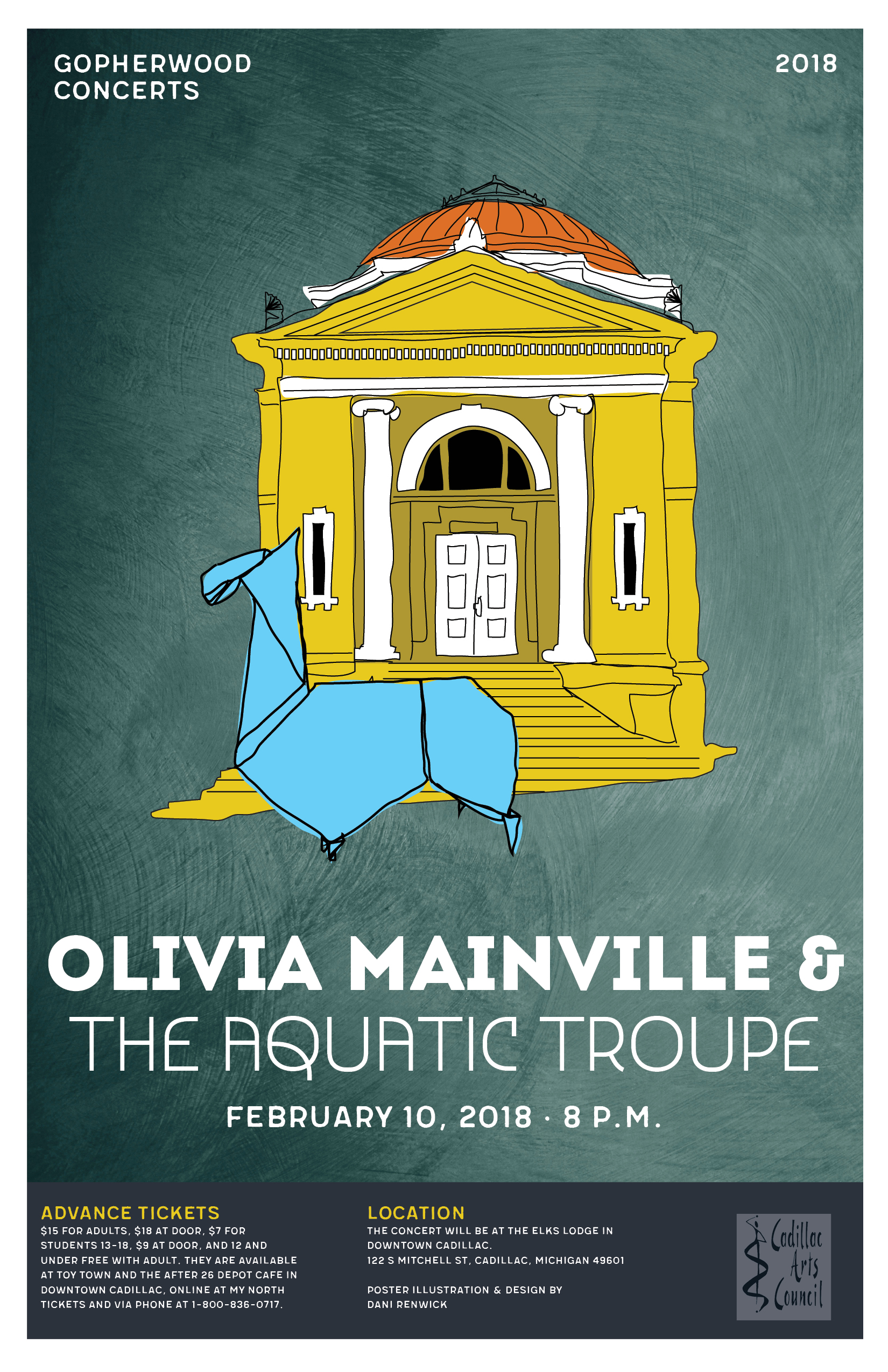
Gopherwood Posters 2017-2018 Season
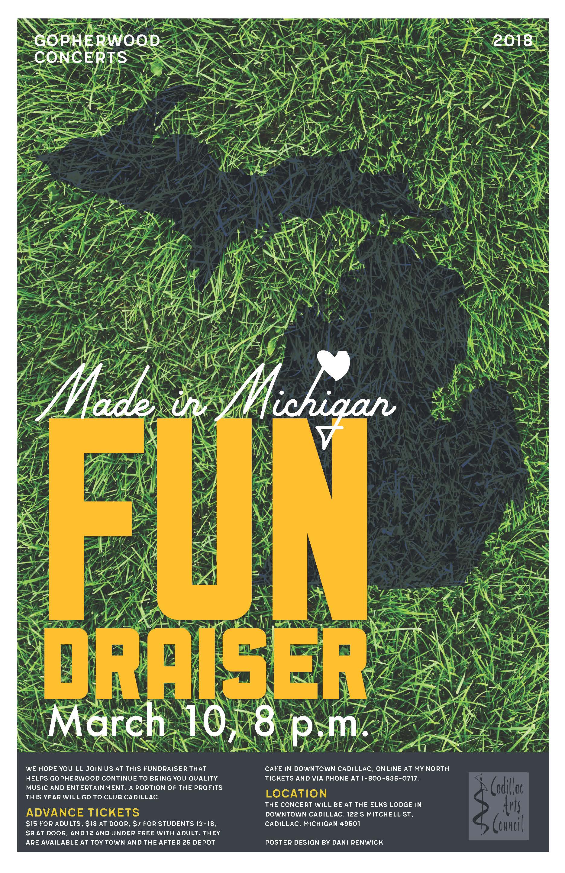
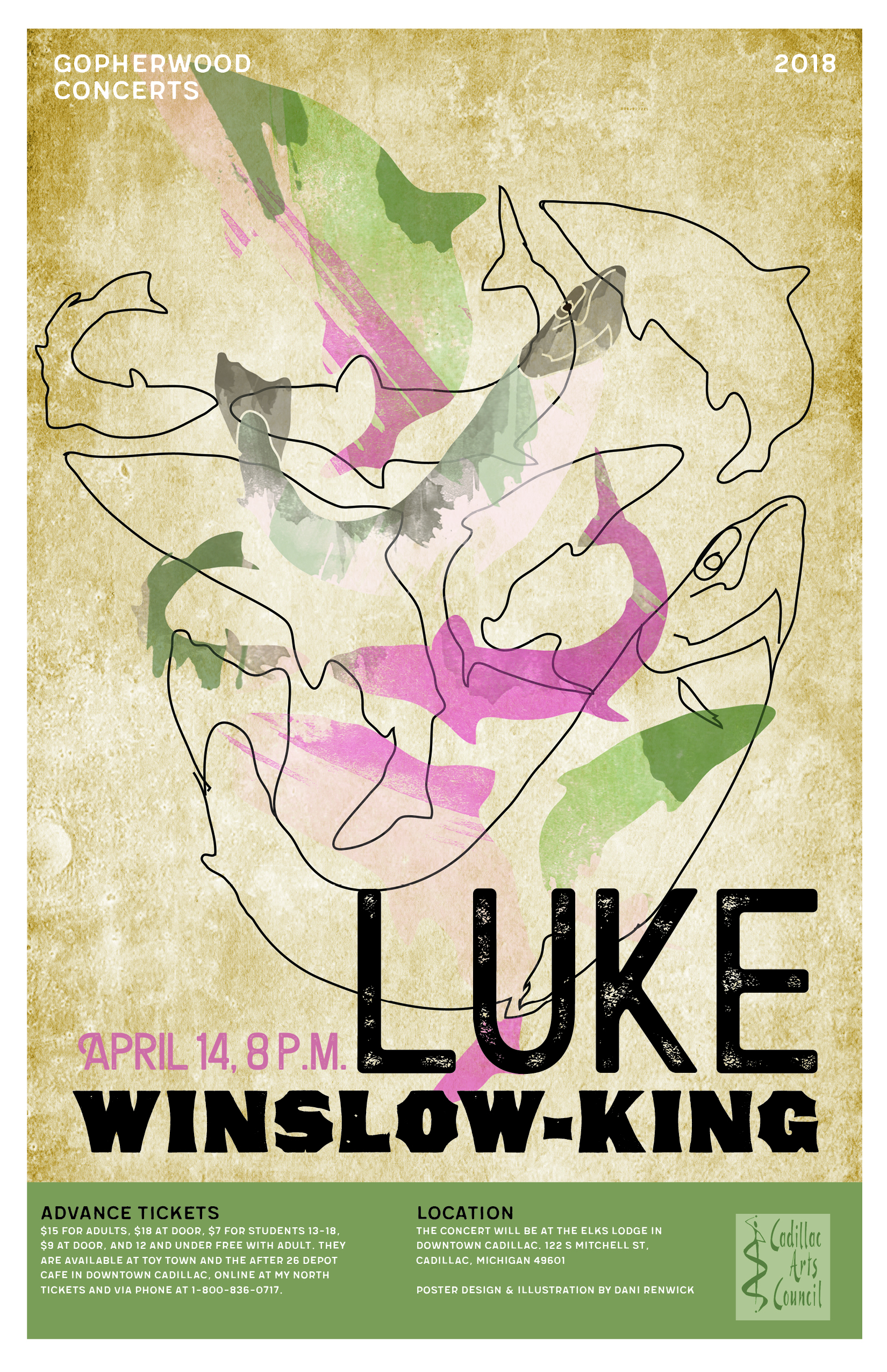
I've been volunteering my poster designs to a local non-profit for about 3 years now. Gopherwood Concerts is a local to Cadillac organization that for 35 years now, has brought awesome musical acts to our quiet town.
I've been volunteering my poster designs to a local non-profit for about 3 years now. Gopherwood Concerts is a local to Cadillac organization that for 35 years now, has brought awesome musical acts to our quiet town.
I recently learned where the name Gopherwood came from and its a pretty relatable story for most folks up here in Michigan. The name came from the commonality that all the members had to "go-for-wood" in the winter months for heat. Pretty funny Northern humor if you ask me.
This year I made more of a templated design than I have in the past. I used the same top title with the year, and the same footer bar with all the info at the bottom. I'd say adding that into the design definitely allows the people who view the posters around town to see that it's part of a series. Another thing that I did with the house concert posters (they had 3 this year) was created a different living room poster for each artist. Generally, the design comes from knowing the artist personally, having listened to them for a long time or I listen to them for the first time and from that knowledge, create a design that jives creatively with the music or person.
Here are all the posters from this years line up. Enjoy!
How to get the Word Out
So, you started a business - YOUR PASSION - and you have a spankin new logo to slap on everything from stickers to hats to can coozies. That's how you market, right? Sort of... When I meet with small business owners, we start by having a conversation about their business, logo, website, photography and marketing. The latter, in my mind, are the elements of your Getting the Word Out Kit. Each has its own complexities and processes, and all work together to paint a complete picture for your audience and customers.
So, you started a business - YOUR PASSION - and you have a spankin new logo to slap on everything from stickers to hats to can coozies. That's how you market, right? Sort of... When I meet with small business owners, we start by having a conversation about their business, logo, website, photography and marketing. The latter, in my mind, are the elements of your Getting the Word Out Kit. Each has its own complexities and processes, and all work together to paint a complete picture for your audience and customers.
Where to Use the New Logo
Your designer worked hard to put together a logo that will both tell people about you but also stand the test of time. You should have a slew of different files - original vector files, JPEG, PNG, PDF.... All the files you will need to populate all of your marketing pieces.
Website - Most websites today have a long version of the company's logo in the upper left hand corner or the site (middle if you're looking on a mobile device). Use the longest version you have to free up space on your web layout. This will make it so your customers have to scroll through less introductory info.
Business cards - Business cards can be a lot of fun, so don't be shy and use ALL of the real estate on your cards. I usually design cards with one side as the logo only, and all names, titles, contact info on the "back." Allows people that moment to really connect with your logo and get a proper introduction to your brand.
Social media profile images - Another reason you need multiple versions of your logo - social media profile images. They tend to be square, and depending what platform you are using can be sized from 180 pixels all the way up to 600 pixels. A stacked version of your logo is recommended here. If you have a circle or square icon version of your logo, even better! Make sure you properly size your images! It makes a difference.
Signage - If you haven't looked into it yet, signs can be very pricey. You'll want to use the full color, vector, full version of your logo for this endeavor. As a tip, make sure you get to see proofs and that everything is spelled correctly.
What to Put on Your Website
This part will definitely depend on what your business is. You may be a small business with a brick and mortar store, so information on how to get there and up to date info about what you'll find in the store is pertinent.
Maybe you are an illustrator and your body of work is the most important thing to showcase on the homepage, followed by your about, contact page, and an active blog about what you are up to.
About - Your about page is really important to your sales. People love to buy from other people they relate to, so make sure you include a short bio and maybe a picture of yourself.
Testimonials - These are gold if you can extract some info from your customers on their experience with you.
Bio - Tell the people something about you that makes them trust you, relate to you, and ultimately makes them want to hire you.
Blog - A blog is an essential way to maintain an updated website.
Balance your sales posts with your education and other posts.
Pick a consistency that works for you and stick to it. The more consistent you are with your blog, the better it will be for you and your site.
Good photography - As overdone as good photography might seem (or as accessible as it might seem) - never take this for granted. Your website is sometimes the ONLY way people learn about your business. Getting good photos taken of your business and services will go a long way.
Do a shoot every year and add it to your marketing expenses. You will never regret it.
A professional photographer will take photos of interesting things and in ways you might not have thought to photograph something. Leave it to the professionals and allow them to work their magic.
Contact Information - This doesn't really need an explanation, but I would include ALL the places people can get in touch with you! Don't put your email address on the site, but DO provide a contact form for people on your site. Do add your phone number and physical address if you have one. Don't add your home phone if you don't want people calling you at it.
Where to promote your website
Facebook, Instagram, Linkedin - share your blog posts, photos and articles about what you are up to.
promote by having a business page where you post consistent and relevant information to your business.
Ads - Facebook and Google both have reasonable ad programs that allow you to set your own budgets.
How to Promote Yourself
Social media will truly only get you so far. Its really up to your blog and relationships to take it to the next level. If you are an artist, maybe you are teaching classes or workshops at other businesses. If you are a clothing store, maybe having events at your store with other artists will build relationships and help both of you. Opportunities are all around us, you just have to be creative and open to them.
Networking events - showing your face around town can't hurt! Get in front of other businesses at networking functions.
Email lists - people who visit your website willingly are already invested in you, so give them what they want - updates right in their inbox.
Direct Mail - Snail mail isn't dead yet - the USPS has some great direct mail programs that allow you to target specific zip codes for maximum ROI.
Events - Having an event at your business or in collaboration with other businesses is always a fun way to get customers to engage. Host an artist pop-up shop at your store and offer fun snacks, or if you are a craft brewery invite someone to do a tap takeover at your restaurant. There are lots of creative ways to interact with your community.
Volunteering your time - Time is so precious to all of us, but one of the BEST ways I have found to network myself was to volunteer for local non-profits. I volunteer for our local Craft Beer Fest, I sat on the board of our local historical society, I make concert posters for a local group that brings music to our town, and have volunteered my time at other events and for other causes as well. I can already see you rolling your eyes, who has time for that? Well it doesn't take as much of my time as you would think, and the connections I have made with all types of businesses in my community has been PRICELESS. I also like helping my community look good, so its really win win for everyone.
This isn't a comprehensive guide to how to market your business, but it does contain some tips and tricks that I have learned along the way. If you have any tips please share them in the comments!


