Ch-ch-ch-ch-changes to Facebook Look
No surprise here, folks. Facebook is constantly working to update their platform, and some changes may be coming down the line for you, as well. Staying current on these changes are essential for getting properly sized images that aren't poorly spaced or cut off by Facebook's cropping. There is a new cover photo size, that is 828 x 315 pixels - or just a slightly more square dimension. I imagine that scales better for mobile.
So it seems they are rolling this change out slowly, but the main things to note are:
1. Unobstructed cover photo.
You can now see the whole image without the title, buttons or anything else obstructing the view. Designers rejoice.
2. Compact Info bar: Goodbye tabs.
I'm totally in favor of this design update. They have cleaned up the information that has been lingering over the cover image into a compact bar that houses your immediate information needs. In my opinion the profile photo for a business page should be your logo anyway, so the fact that they made it much smaller is okay with me. So everyone, put a nice clean logo in that space and let your cover photo shine with all the personality your business encompasses. The former tabs of info have now moved into a responsive parallax right hand navigation.
3. Flip flop of left and right navigation for desktop.
So they redesigned the left and right page navigation for the better. I like that you have the minimal responsive (formerly "tab" info) menu on the left, and then photos, events, videos, reviews and more scrolling down the right side of the newsfeed. Makes more sense for our left-to-right reading and natural information separation, and for my OCD. This change isn't as noticeable on mobile, but you can tell that they have moved a lot more of the "right hand column content" and insight info to the top of the page, and you have to scroll further for the newsfeed.
Along with these visual changes, there are sure to be other less visible updates. But as your neighborhood designer, its my duty to keep you current on the visual changes! So update those profile pics to clean logos, and adapt your cover photo to fit the new sizes.
Rebranding a Legacy
In the summer of 2015 my friend Laura came to me to make one of her businesses a new logo. She owns Adventure Island Family Fun Park in Cadillac, Michigan. Cadillac is my home town where I live and run my design business. We both grew up here, and both spent (her much more than me) a fair amount of time at The Island. I have a bit different perspective of it; my grandpa was a sign painter and had painted all their signage when I was quite young. I was really excited to design Laura and her family a new logo and identity. There’s not a lot to do here in this small town, and certainly we could get her more business from all the bored people here! I also really enjoyed the idea that my grandpa and I would share a client.
Adventure Island has been around for thirty plus years. Owned by the Dunbar family for the last three decades, this place lives in the memories of thousands of local Cadillicans and Michiganders alike. It consists of a tiny mountain with mini golf, the largest go-kart track in Northern Michigan, batting cages, waterslides, arcade, park amenities and ice cream. Like many places in Cadillac, hard economic times have had a hand in the aging of our local icons. The joint was in need of an update.
Some of the immediate things that needed attention to me were the website, the road sign and all the signs stating cost and height requirements. These were hand drawn by seasonal high school workers. They had nice handwriting but its still not an ideal way to command attention in a busy place like that.
I got to work and designed them a youthful logo that was both currently relevant, but also could last well past a decade. Thick lines house icons of all of the attractions activities. Paying a little homage to my talented Gramps, I used a friendly sign painter style font for their name. Parks of this nature need to be energetic and vibrant, so a simple primary color palette was an easy and obvious choice.
The full identity includes a badge style stacked version, a more sophisticated horizontal version with their full name, colors, fonts, and styling. The brand styling has been fully realized as new uniforms, updated social media appearance, brand new website, new paint in the entry way that matches the brand colors, a brand new menu system and supplemental signs.
One of the signs is a height sign, and its based on a character that was hand painted and his hand was used as the height requirement. I recreated him onto a new height sign, another way that we kept the fun history.
Another really big part of the merchandise is the original logo. We kept that and created some throwback merch with the iconic red script. In situations where the original logo is so recognizable, I really think its okay to hang onto it and use the nostalgia as a way to make some sales. So far that is going as planned and people love that vintage vibe.
We just had the 2016 season opener yesterday, and the official launch of the new uniforms, merch and updated entry way environment were well received. The colors were fun and vibrant. We still have work to do to replace the road sign; that and billboards are the next elements to the updated campaign. Next year we will be replacing all the way finding originally done by my grandpa. I am both sad to replace it and happy that its me that will get to update it. Sort of bitter sweet, his legacy is living on there. He passed in 2012, and is dearly missed. But I get a ton of pride knowing that I get to do this work for people he liked doing work for as much as I do. I get to update and keep the creative in the family. Pretty cool that it brings us all together, too.
Gopherwood Concerts Posters 2015/2016 Season
When I started Charmellow, I had 2 clients and a half a sandwich. Just kidding, but really not much more than that. I needed to network and began volunteering for local nonprofits and event committees. I found out that I really like helping local places do a better job of getting the word out about their awesome causes.
Gopherwood Concerts is a nonprofit that brings musicians, both local and national, to our little town. Artists such as Joshua Davis (from NBC's The Voice), Rachael Davis, Willy Porter, The Sweet Water Warblers and so many more talented peeps have graced the stage of the Cadillac Elks Lodge. I am excited to have donated my expertise to such a great cause.
Here are a few of my favorite posters from this years series. Check them out on their Facebook Page if you feel like catching a show next season.
Charmellow is Handmade
As the title says, Charmellow Design is very much homegrown, down to earth, handmade company. I started it myself, I make everything myself. But what I do in graphic design land is very much inspired by what I make at home.
I’m constantly creating things. I don’t spend a lot of daylight hours watching TV or relaxing. I actually can’t relax, I’ve learned. I feel best when I am using my hands, doing something. Using my brain at least engaged in a game. I have a dining room at home that is the headquarters to weekly Collage Night, and a table full of crafty stuff just waiting to be put to use.
I have drawn, colored and collaged from an early age like many artists I know. In high school I took “art class,” photography and newspaper. At community college I took life drawing, printmaking, perspective drawing and advertising classes. At art school, heh, I feel like I got to take almost all of the “holy grail” classes I could imagine. My all time favorite was Book Arts which involved a ton of awesome, I want all of them, printing techniques. I still love making books so much.
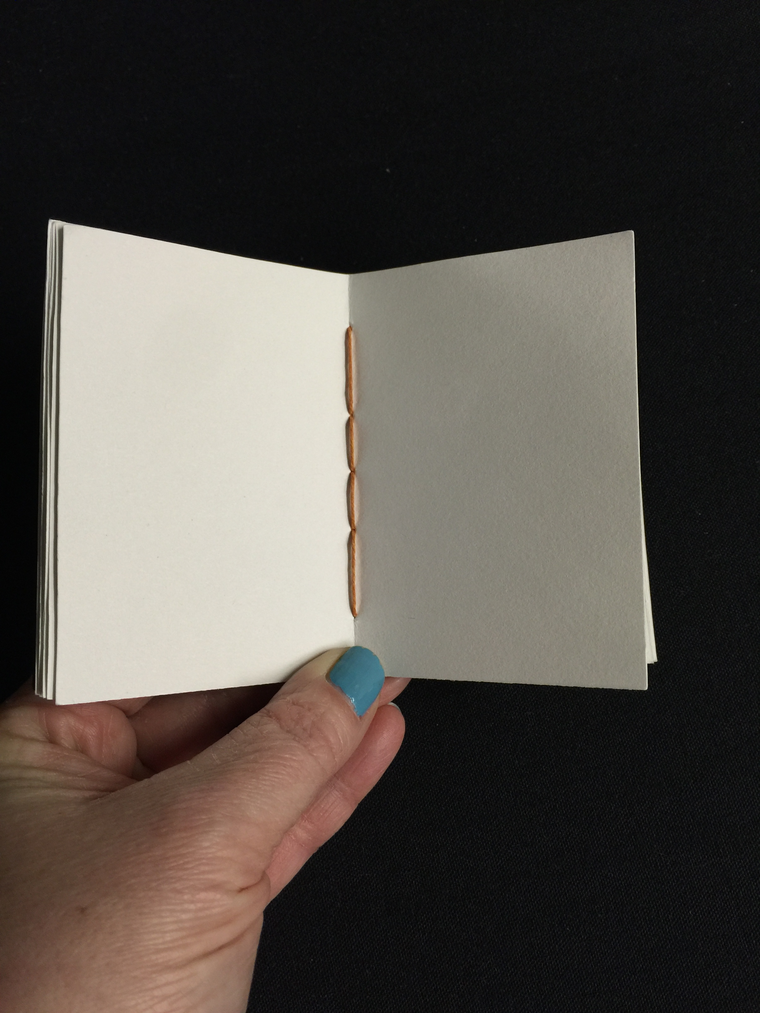
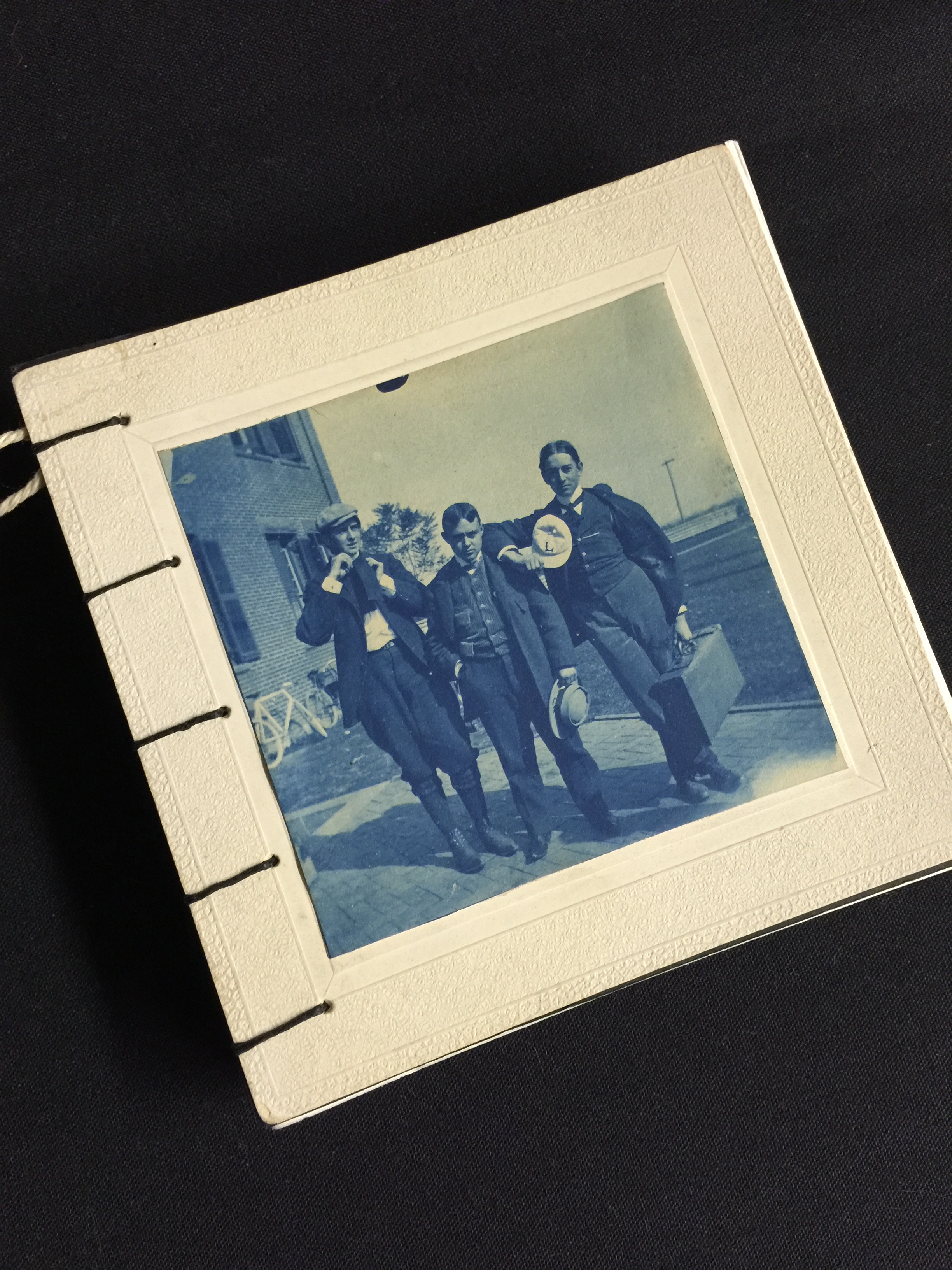
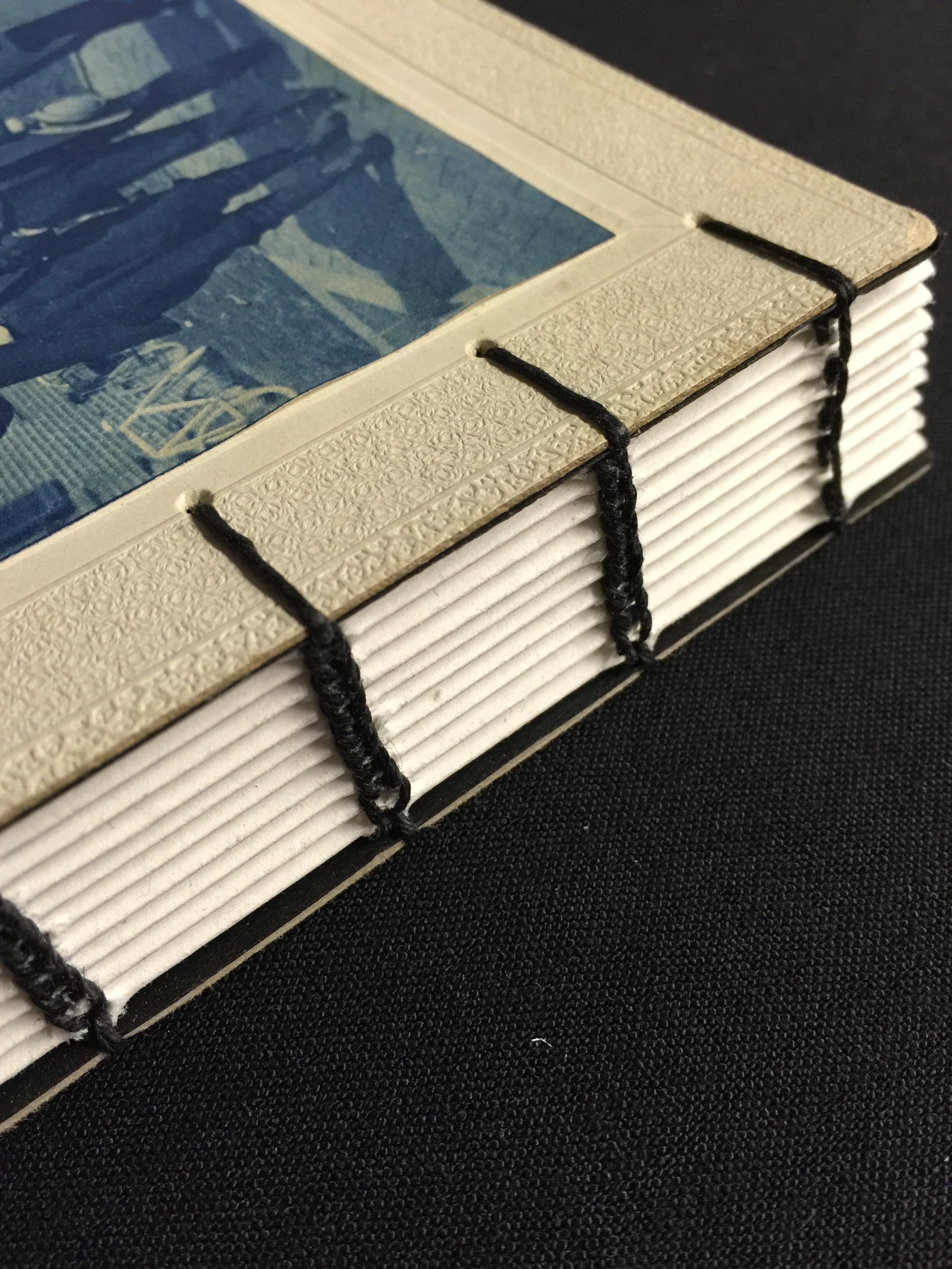
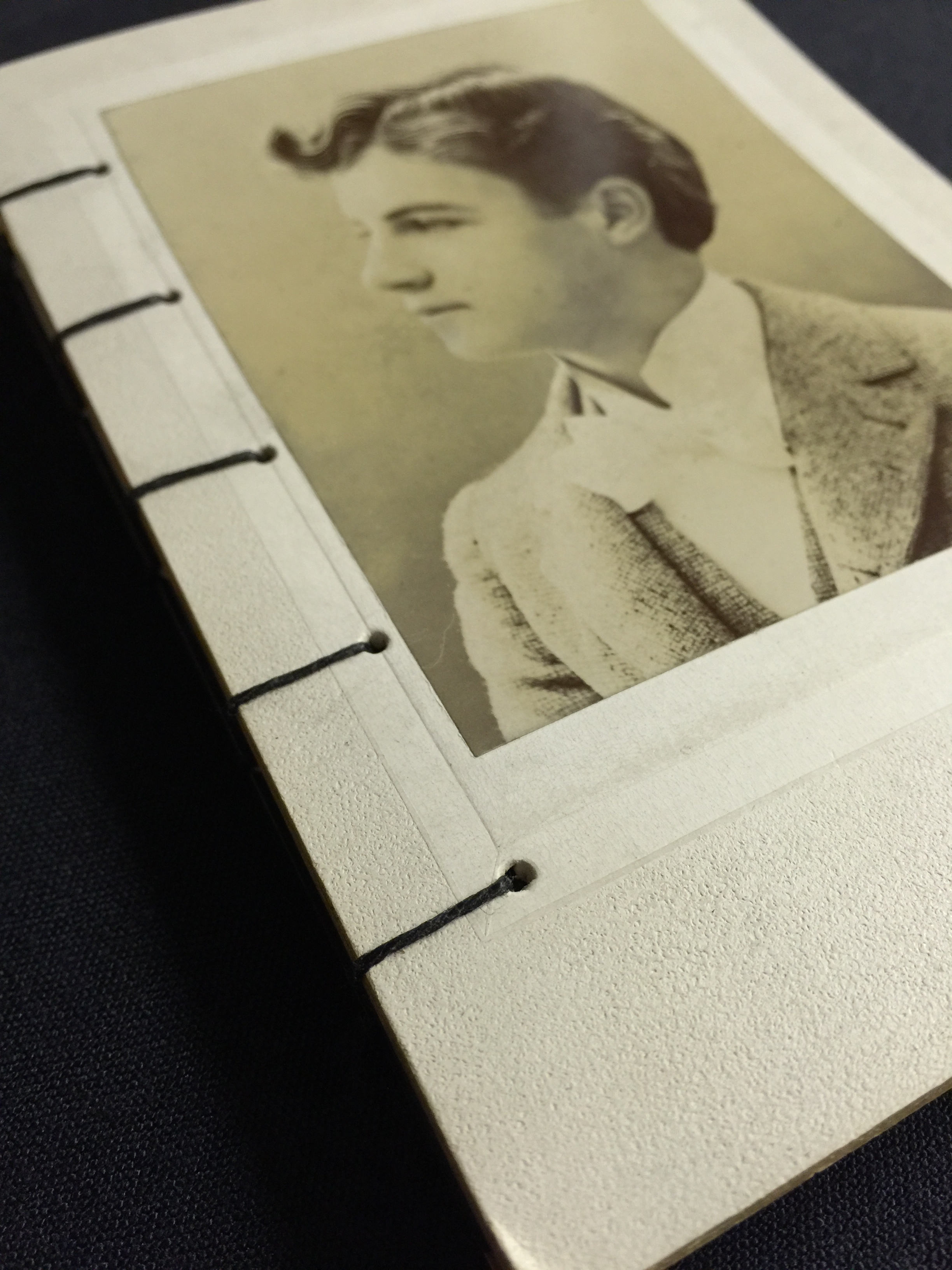
So this story is dedicated to that, and shamelessly plugging the Etsy shop where I sell my one of a kind pieces. I cut, fold, punch holes and sew every book completely by hand. In Michigan. Where winter is long and cold. Just kidding, its not really THAT ominous...
The reason this is important to what I do for businesses that hire me to do graphic design, is because designing things is truly a way of life for me. I make books, screen print posters, carve my own stamp ideas for printing, draw almost every day… For fun. I love the arts. I love creating meaning and bringing life into lines and brushstrokes.
If you think about it, that’s what graphic design does for business, too. When I am making a logo for someone, I’m researching and learning about their business. I am learning the ins and outs, the goals, passions and favorite colors. I am tapping into what makes that business unique, and then I am telling everyone that story with their identity system. I am making a logo that is bursting with the who, what and why of your company.
Story telling is what its all about. I believe that the books I make, the logos, the websites I’ve made and the posters I labor over tell the story of who I am. A story teller.
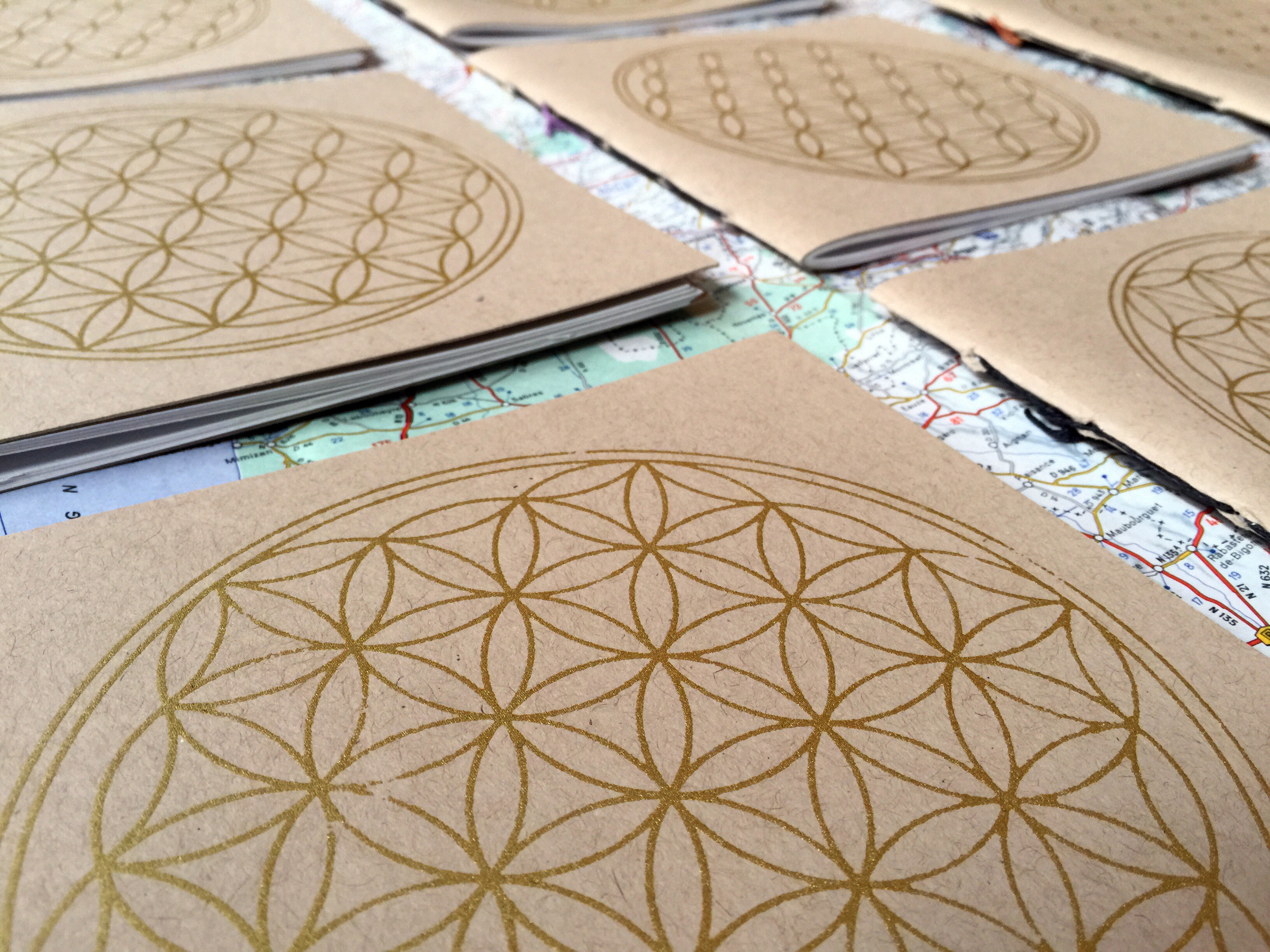
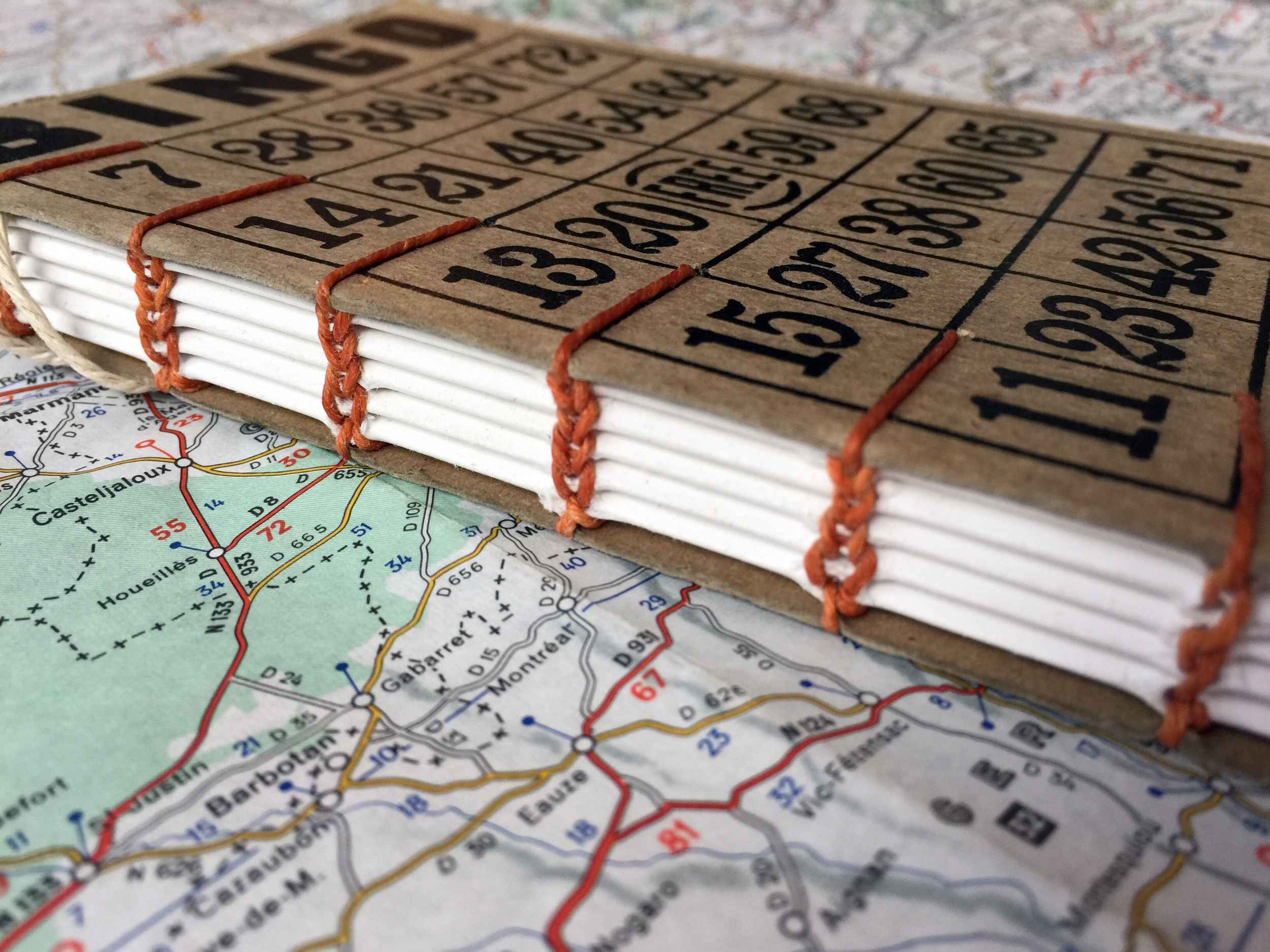
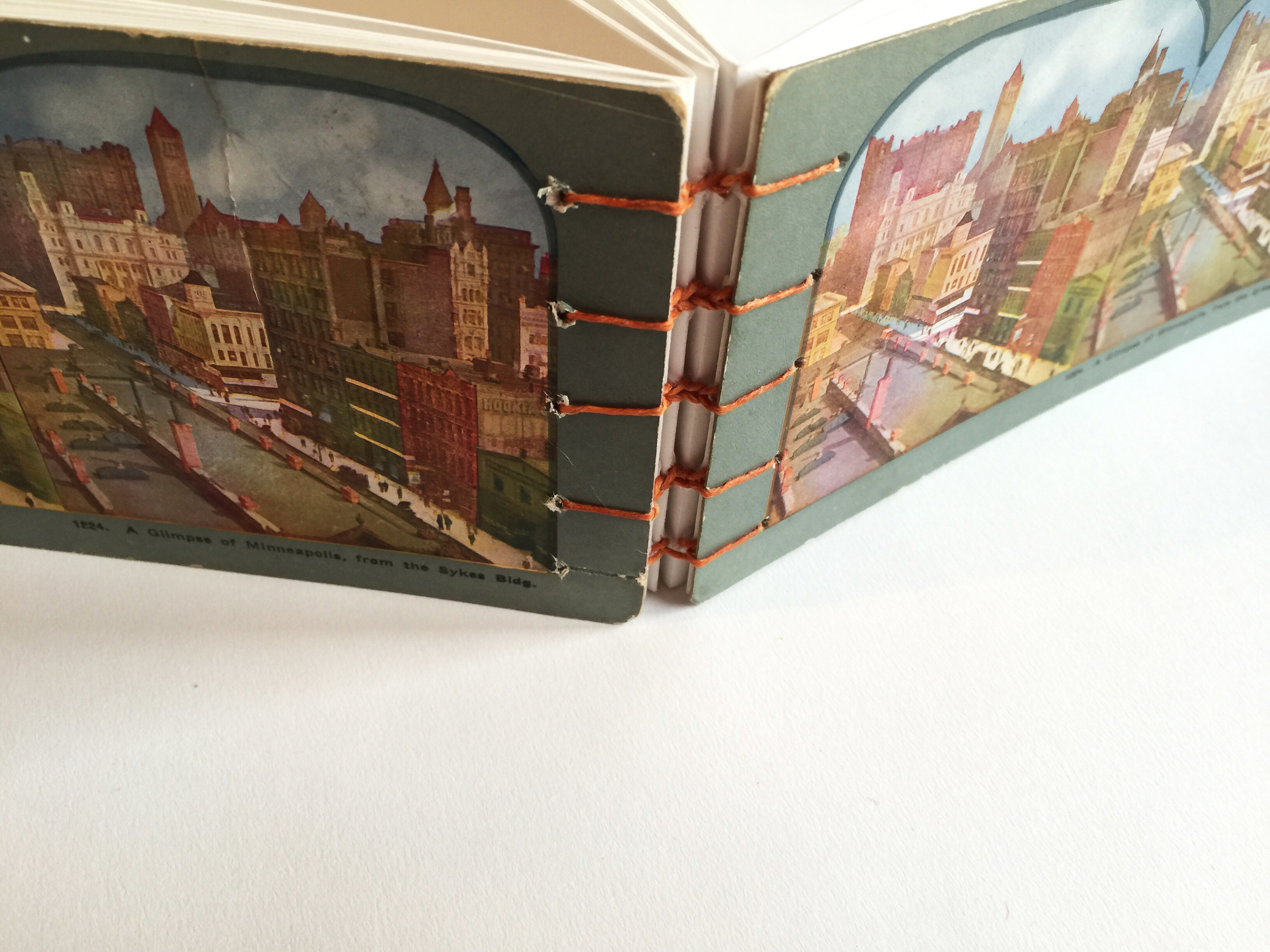
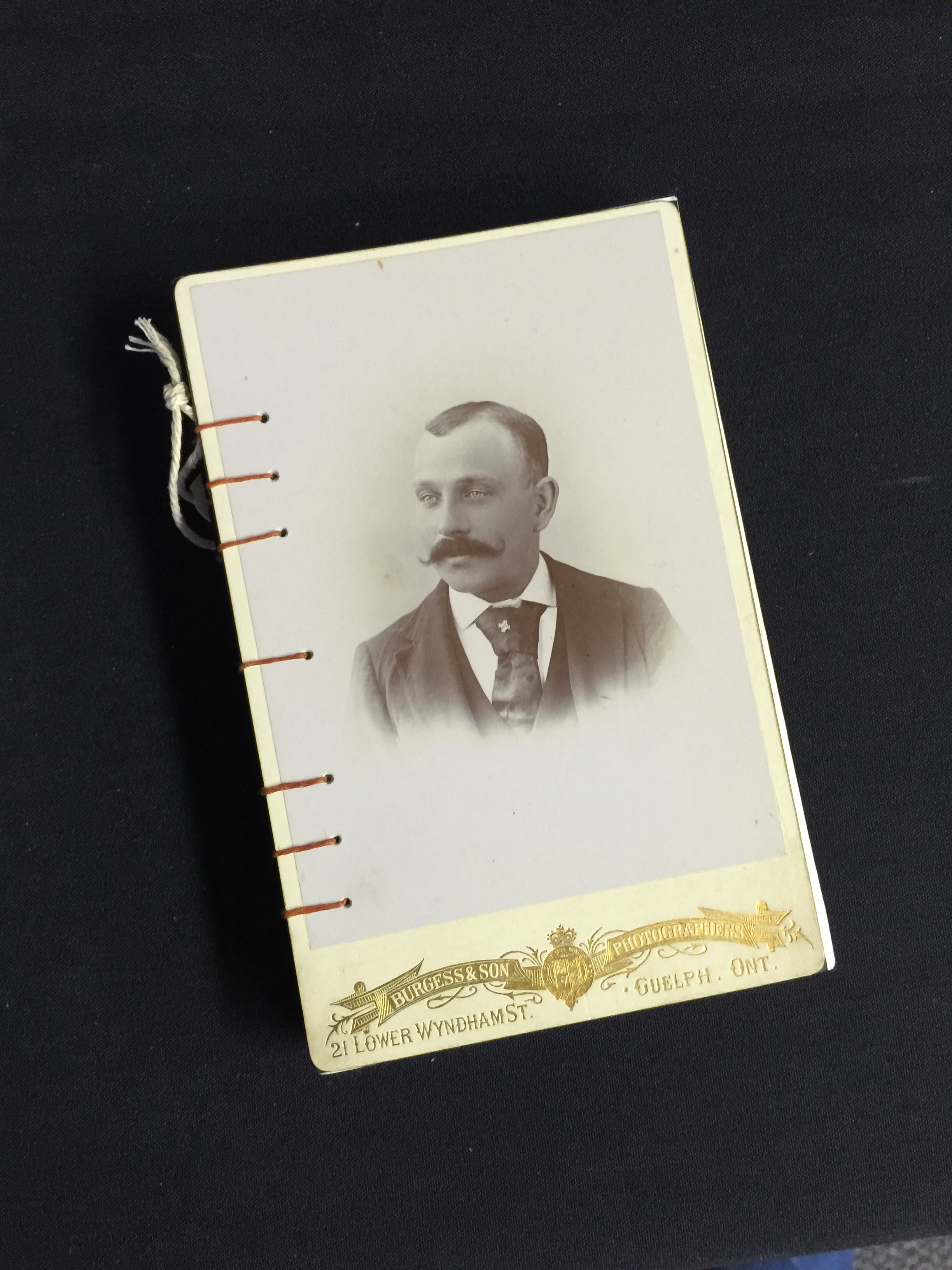
Here are some pics of some of my favorite books I’ve made recently. And click HERE for my Etsy shop.


